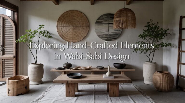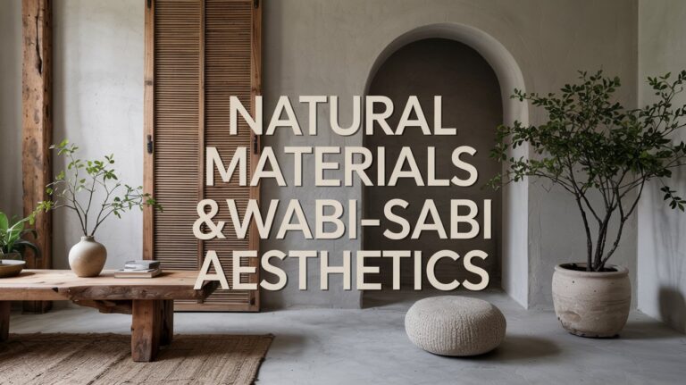
Creating a Serene Atmosphere Through Wabi Sabi-Inspired Lighting Choices
I have been, or can be if you click on a link and make a purchase, compensated via a cash payment, gift, or something else of value for writing this post. As an Amazon Associate, I earn from qualifying purchases. Please read my full Affiliate Disclosure for more information.
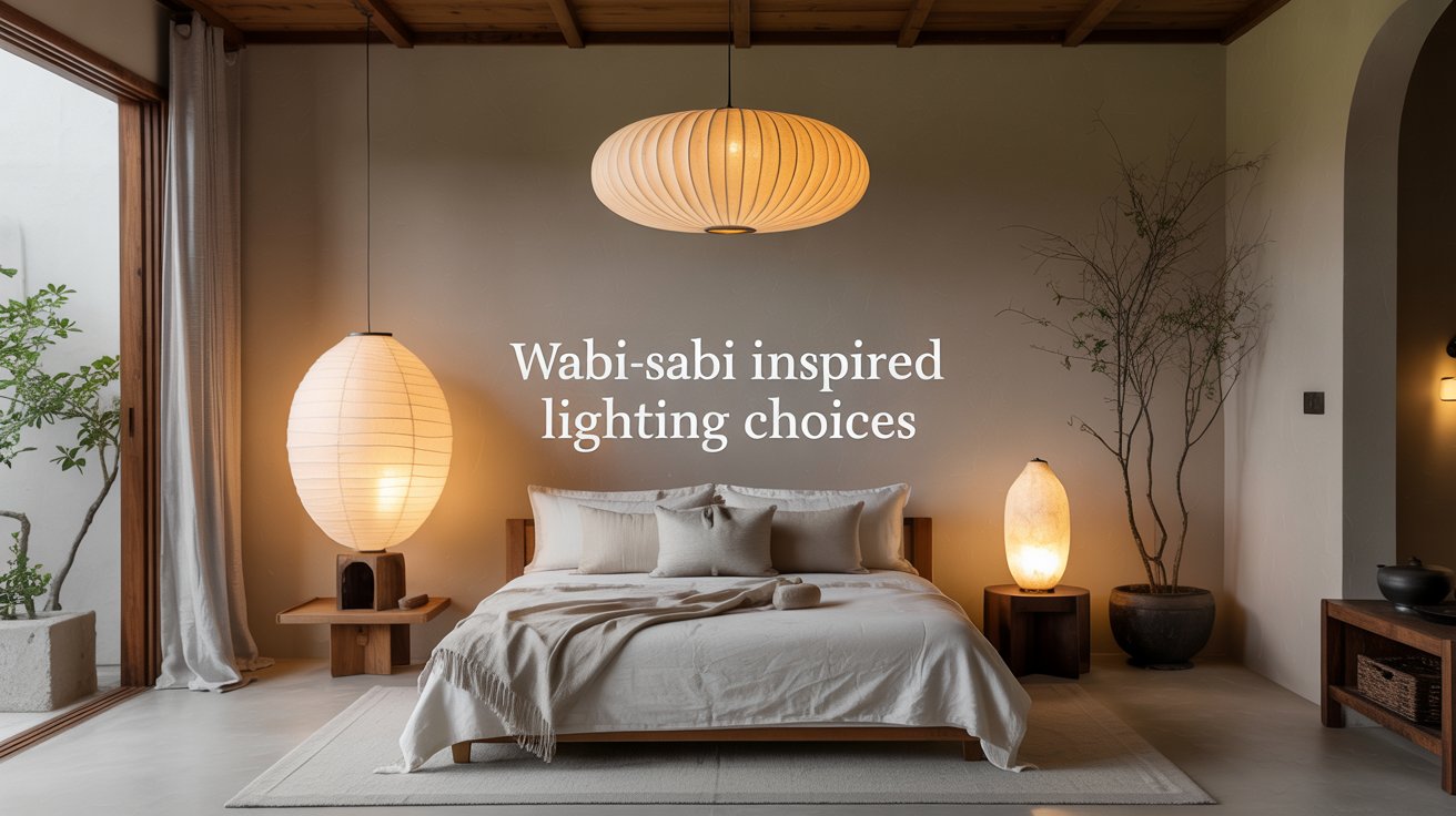
To create a serene, Wabi Sabi–inspired space, you’ll lean into warm, imperfect light that highlights authentic textures. Choose soft, amber hues and honest materials—weathered wood, rough stone, linen—so surfaces tell their stories. Layer ambient, task, and accent lighting to sculpt gentle shadows, never harsh glare. Let natural light drift in through sheer curtains, revealing patina and wear as character. Maintain restraint, allow aging surfaces to breathe, and you’ll craft a calm, human glow that invites you to explore more.
Key Takeaways
- Embrace warm, soft lighting and avoid cool temperatures to cultivate a calm, human-centered mood.
- Layer ambient, task, and accent lighting to reveal textures and subtle shadows without glare.
- Choose honest materials (stone, wood, linen) with gentle patina to add character and warmth.
- Use dimming and indirect light to create a tranquil glow that highlights aged surfaces.
- Align lighting with natural light, soft curtains, and restrained fixtures to maintain serenity and rhythm.
Understanding Wabi Sabi Lighting: Principles for a Calm Space
Wabi Sabi lighting embraces imperfection and quietude, letting natural textures and soft shadows do the talking. You’ll discover simple truths: light isn’t about brightness alone; it’s about mood, rhythm, and restraint. Principles center on minimalism, honest materials, and calm repetition that guides attention without glare. Seek muted palettes, warm temps, and gentle gradations that invite reflection. Focus on balance between light and shade, avoiding harsh contrasts. Minimalist elegance and natural harmony emerge when fixtures feel inevitable, not chosen for show. Your space becomes deliberate, serene, and tactile, inviting quiet reflection through thoughtfully restrained illumination.
Embracing Imperfection: Textures and Materials That Warm a Room
Textures invite touch, and imperfect materials glow with quiet warmth in your space. You’ll notice how rough stone, worn wood, and soft linen soften light and create a tactile rhythm. Embrace the flaws—the places where texture breathes—so warmth becomes your room’s subtle glow.
Textures That Warmth
Soft textures invite you to touch and linger: rough-hewn woods, woven fabrics, and matte ceramics absorb light and dampen echoes, creating a calm warmth that feels lived-in rather than styled. You’ll notice natural fibers in rugs and cushions, pairing with timber tones to soften edges. Choose tactile surfaces that invite interaction: linen, wool, and cotton blends for warmth without glare. Subtle imperfections become character, not flaws, guiding your eye to a calm, cohesive palette. Keep contrast gentle, light, and monochrome where possible, so textures lead the mood. Your room breathes quiet confidence, grounded in simple, honest material truth.
Imperfect Materials Glow
Texture, not perfection, does the warming work here: imperfect materials glow with character, inviting touch and quiet admiration. You notice how light plays on rough edges and soft crumples, revealing depth in everyday goods. Embrace texture through handcrafted fixtures that feel honest, unpolished, and alive. Let textured surfaces respond to movement and air, catching shadows that shift with time. Choose options that celebrate irregularities—faded chalk, grainy stone, uneven glaze—so warmth emerges from authenticity. Keep clutter minimal; allow natural imperfections to guide the eye. This approach cultivates calm, tactile glow, and a room that breathes with simplicity.
The Power of Soft, Warm Color Temperature in Serene Ambience
Soft, warm light wraps a space in quiet clarity, shaping moods without shouting. You’ll feel how color temperature guides perception: warmer tones soften edges, invite touch, and calm the mind. In serene interiors, ambient illumination breathes gently, avoiding glare and abrupt contrast. You’ll notice how subtle shifts—from soft amber to pale honey—transform textures and materials into tactile statements. The power lies in restraint: not bright white, not cool, but a intentional warmth that fosters focus without fatigue. Embrace color temperature as a tool for harmony, ensuring every surface reads as calm, coherent, and deliberately human.
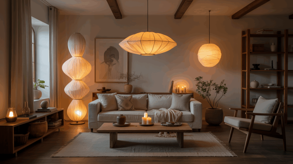
Layering Light: Ambient, Task, and Accent for Subtle Depth
Layering light creates depth without noise: ambient glow, targeted task lighting, and deliberate accents work together to reveal texture and form. You balance warmth and contrast, letting each layer breathe. Ambient light provides a soft field that frames your space. Task lighting highlights details—where you read, prepare, or craft—without glare. Accent lights sculpt shadows, drawing attention to subtle material shifts. In corners, a floral arrangements glow adds life without shouting. Decorative accents gain presence when lit indirectly, avoiding distraction. The result feels serene, tactile, and precise—a quiet composition you can touch, observe, and inhabit.
Natural Light as a Core Element of Wabi Sabi Design
Natural light is the quiet backbone of wabi sabi—the simplest way to reveal texture, form, and the passage of time. You’ll feel daylight soften edges, inviting calm and honest color. Embrace restraint, let shadows tell stories, and connect space to season.
- Observe how morning light highlights imperfect surfaces with gentle warmth
- Align windows to frame fleeting moments, not stage sets
- Use sheer curtains to diffuse glare while preserving color psychology
- Pair bare decor with negative space, enhancing minimalist decor through subtle contrast
Clarity comes from restraint; light becomes texture, mood, and memory.
Fixtures That Feel Handcrafted: Choosing Uneven, Organic Forms
Fixtures that feel handcrafted aren’t about perfection. You’ll notice subtle asymmetry, rough edges, and imperfect curves guiding the eye. Handcrafted fixtures embrace flaws as texture, inviting touch and presence in your space. Choose organic forms—bulb shapes that taper, pendants with irregular drops, bases that look carved rather than cast. The aim is coherence, not polish, so materials matter: natural stone, raw metal, hand-blown glass. Pair with muted tones and a soft, warm glow to emphasize tactility. These handcrafted fixtures communicate restraint through detail, celebrating handmade craft and the serene irregularity of organic forms in daily living.
Dialing Down Brightness: Restraint and Glow Over Burnished Illumination
You tune the room with a soft, constant glow, letting the light breathe rather than blaze. Its quiet balance invites you to notice texture, shadow, and the space between moments. In this restraint, glow becomes a tactile rhythm you can feel as you move through the room.
Subtle Illumination Balance
Subtle illumination isn’t about brightness as much as intent. You shape a room with careful, tactile light, not a blaze. The aim is calm clarity, where diffused lighting softens edges and contrast emphasis guides attention.
- Dimmed layers create depth without glare
- Soft shadows reveal textures gently
- Prevent harsh hotspots by balancing sources
- Let bursts of glow appear only where desired
You’ll notice how restraint invites perception—less is more, more meaning. This balance honors the space, inviting touch, breath, pause. With patience, illumination becomes conversation, not showcase.
Quiet Glow Principles
Quiet Glow Principles invites you to choose restraint as a design act. You dial down brightness, not out of avoidance, but to honor space. In this approach, glow wins over glare, and ambient echoes become part of the room’s breath. You’ll notice how soft light reveals texture, a tactile quiet that invites touch and patience. Shadow play arrives as a natural companion, not a distraction, shaping depth without harsh edges. This is lighting as restraint, where each flicker and glow feels earned. You create calm by allowing illumination to speak softly, leaving room for presence, gesture, and everyday clarity.
Atmosphere Through Shadows: How Light and Darkness Tease Comfort
Light spills softly, then withdraws, leaving pockets of shadow that invite you to pause. You sense shadow play shaping mood, while darkness contrast gentleizes what’s near. You learn to read light as texture, not glare.
- Embrace dim edges that cradle forms
- Let small contrasts reveal material grain
- Allow pauses where sight settles
- Use shadows to guide quiet rituals
This is minimal convivence: tactile, calm, precise. You feel depth without clutter, distance without coldness. Shadows act as a soft frame, not a curtain; the room breathes, inviting you closer. Shadow play and darkness contrast teach restraint, turning everyday spaces into mindful refuges. You choose lighting that teases comfort, never shouts it.
Maintenance Grace: Aging Surfaces and Patina as Design Assets
Aging isn’t damage here; it’s texture you can touch. Let patina speak in quiet tones, shaping mood with its subtle, honest marks. You’ll notice how wear becomes a deliberate design element, proof of time lived.
Aging as Asset
Fine patina isn’t a flaw to hide; it’s a record of use. You learn to read warmth in aging surfaces, letting light converse with texture. Aging as asset becomes a quiet strategy: accept evidence of time, then shape calm around it.
- Notice how vintage ceramics glow when lit gently, their glaze telling stories.
- Embrace weathered textiles as soft, tactile anchors for mood and color.
- Pair patina with simple lines to highlight texture over perfection.
- Maintain restraint; edit reflections to preserve subtle, serene ambience.
The result feels grounded, honest, and effortlessly refined.
Patina’s Quiet Charm
Patina quietly speaks in every surface, a soft ledger of use that adds depth without noise. You notice how hours and hands leave whispers on metal, wood, glass, turning ordinary into memory. This patina’s quiet charm isn’t a flaw; it’s evidence of life lived, a subtle texture you can feel. Treat aging as asset, not obstacle: let the marks guide light, soften edges, invite warmth. Maintain with restraint—clean gently, buff sparingly, respect built character. In your space, surfaces tell stories without shouting, creating serenity. Embrace the imperfect glow, and your lighting gains timeless patience, a calm, tactile presence.
Practical Tips for Curating a Wabi Sabi Lighting Palette
Curating a Wabi Sabi lighting palette means choosing pieces that feel honest and intimate: simple forms, soft textures, and a quiet glow that ages with character. You’ll lean on tactile materials and restrained contrast, embracing imperfect symmetry. To guide you, consider:
- Choose minimalist fixtures with clean lines and warm dimming.
- Pair organic color schemes—cream, taupe, driftwood—with natural textures.
- Mix heights and exposed bulbs sparingly for subtle drama.
- Prioritize longevity over trend, opting for hand-finished surfaces and sturdy builds.
Your space becomes calmer, more honest, and wonderfully human through deliberate, thoughtful light.
Conclusion
In this world of quiet glow, you learn to listen to light. It isn’t loud or perfect; it’s patient, warm, and honest. You layer softly, embracing creases, textures, and shadows that feel lived-in. Let brightness ease, never shout. Patina becomes poetry, and imperfect edges tell your story. With restraint, your space breathes—calm, intimate, tangible. You don’t chase brilliance; you cradle serenity. This is wabi sabi: a light you barely notice, shaping your everyday stillness.