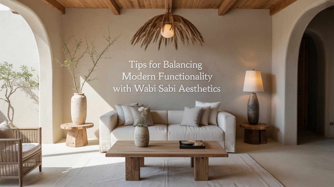
Tips for Balancing Modern Functionality With Wabi Sabi Aesthetics
I have been, or can be if you click on a link and make a purchase, compensated via a cash payment, gift, or something else of value for writing this post. As an Amazon Associate, I earn from qualifying purchases. Please read my full Affiliate Disclosure for more information.
Balancing modern function with wabi sabi starts with embracing imperfect, durable materials and simple interfaces that age with character. You’ll trim excess to keep focus clear, letting texture, patina, and subtle flaws signal use and time. Favor quiet, tactile interactions, restrained color, and modular, repairable design that honors sustainability. Create calm environments where natural light and sound soften the pace. As you curate, prioritize longevity over trends, inviting a timeless, practical elegance that invites you to stay awhile—there’s more to uncover.
Key Takeaways
- Embrace imperfections as character, letting subtle flaws signal human craft and aging gracefully over time.
- Choose durable, repairable materials with finishes that mellow, promoting longevity and quiet elegance.
- Prioritize minimal, intuitive interactions and restrained visuals to balance modern functionality with calm aesthetics.
- Use natural textures, patina, and muted colors to create a timeless, sustainable mood that ages gracefully.
- Design with modularity and mindful pacing, reducing clutter while supporting steady, focused use.
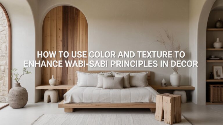
Embracing Imperfect Yet Intentional Materials
Embracing imperfect yet intentional materials means choosing what quietly speaks to you rather than what merely looks flawless. You’ll notice texture, weight, and character creating a story that simple polish can’t offer. The goal isn’t perfection but presence: handcrafted imperfection that invites touch, age, and use. When you select materials with intentional authenticity, you choose resilience through lived wear rather than pristine sameness. Let surfaces patina, joints breathe, and edges reveal their history. You’ll conserve resources by valuing longevity and repair over replacement. In practice, prioritize tactile feedback, subtle variation, and honest finish—materials that become partners, not props, in everyday rhythm.
Prioritizing Usability Through Minimalist Interfaces
You’ve valued materials with character; now you’ll value interfaces that honor your time. Prioritizing usability means stripping excess and guiding the eye. Minimalist interfaces reduce cognitive load, delivering clear paths and predictable outcomes. Gesture based navigation invites fluid, intuitive movement, but it must be obvious and forgiving, not clever for clever’s sake. Voice activated controls offer hands-free clarity, yet require accurate feedback and privacy safeguards. Each decision serves focus: show only what you need, when you need it, with consistent cues. Balance aesthetics with function by testing often, valuing efficiency over ornament, and letting simplicity carry your intent.
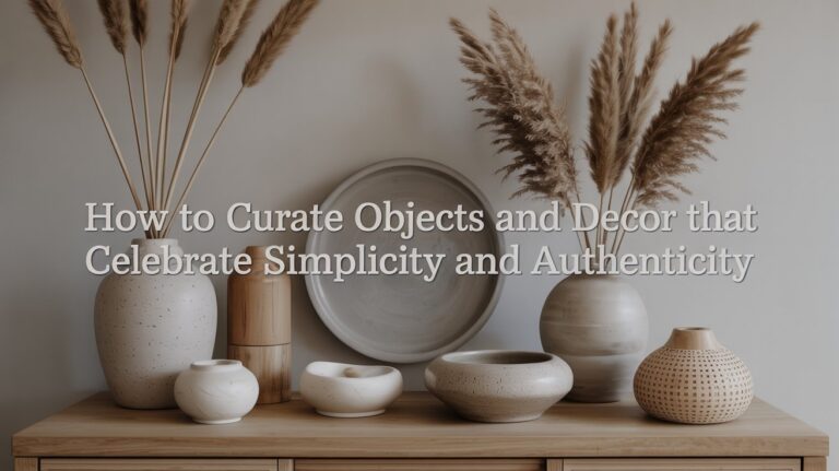
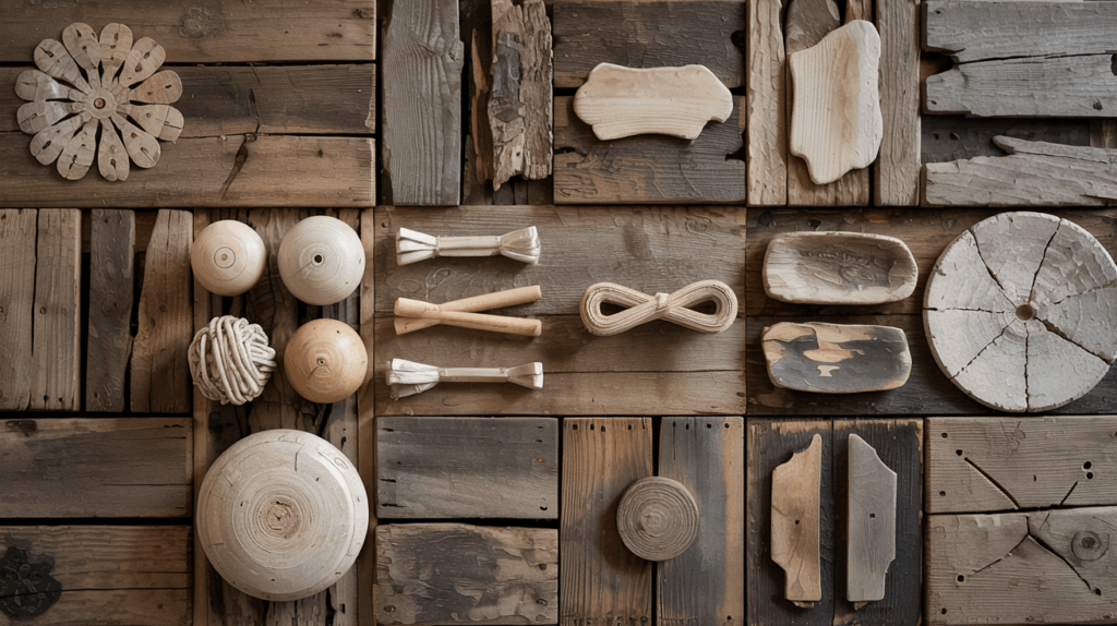
Texture and Patina: Letting Time Inform Design
Texture carries memory, so you let worn surfaces tell their stories rather than masking them. Patina becomes your design language, showing time’s touch as a natural patter rather than a flaw. Embrace these marks as intentional detail that grounds modern function in lived experience.
Embrace Worn Textures
Texture and patina aren’t flaws to hide but signals to lean into; worn surfaces tell a story of use, craft, and time. You embrace texture by letting imperfection guide your choices, not restrict them. Seek objects where texture creates depth, where scratches, wear, and patina contribute meaning. Prioritize textural contrast—combine matte with sheen, rough with smooth—to reveal layers of history. This approach delivers visual authenticity: surfaces feel earned, not manufactured. In practice, pair durable, modern forms with worn details to balance function and poetry. You’ll design spaces that communicate restraint, intention, and a lived-in clarity.
Patina as Storytelling
Patina isn’t decoration alone; it’s a record of use, a quiet archive you can read in the grain, patter, and wear. You’re not chasing perfection; you’re listening to the material’s chatter, letting aging narrate itself. Patina storytelling invites correction without erasure: subtle scratches, softened edges, and tonal shifts become meaning, not flaw. Each mark maps a function, a habit, a moment of care. In design, honor aging narratives by selecting finishes that respond honestly to use, avoid masking with sheen, and celebrate texture over flawless polish. The result is resilient ambience grounded in truth, precision, and time’s patient conversation.
Subtle Flaws as Design Features
Subtle flaws aren’t hindrances here; they’re deliberate signals that a thing is human, alive, and evolving. You’ll see design as conversation, not conquest, where imperfect edges invite touch, attention, care. When you embrace characteristic asymmetry, you acknowledge that balance isn’t sameness but nuance, a tactile prompt to look closer. Intentional irregularity becomes a feature, not a flaw, guiding usage without perfection’s rigidity. Practicality and poetry meet: flaws inform resilience, ease of maintenance, and character. You’ll curate spaces and objects that age gracefully, revealing stories rather than hiding them, proving every detail can teach restraint, worth, and quiet wonder.
Simplicity in Layouts and Workflows
Simplicity in layouts and workflows isn’t about stripping life out; it’s about clearing paths so you can move with intention. You design with focus, trimming steps that don’t serve a goal, embracing digital minimalism as a compass. You choreograph interfaces and desks into calm, clutter free spaces where attention isn’t pinged by excess. Menus become routes, not obstacles; routines become rituals that repeat without friction. You test, measure, refine, and let decisions rest on clarity, not cleverness. The result is efficiency you feel, not just see—work that flows, thoughts that breathe, progress that’s steady and mindful.
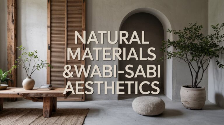
Natural Color Palettes and Material Harmony
Natural color palettes ground your design in the tangible world, where warmth comes from the grain of wood, the depth of stone, and the softness of natural fibers. You balance hue, value, and saturation to create calm cohesion. Focus on color coordination that respects texture and light, avoiding jarring contrasts that disrupt harmony. In material selection, prioritize authentic finishes, durability, and tactile honesty. Pair matte ceramic with warm timber, or linen with stone for understated contrast. Let subtle shifts guide emphasis, not spectacle. Precision in selection preserves quiet beauty while supporting modern usability and timeless, functional elegance.
Crafting Quiet, Pleasant Interactions
You notice how subtle cues guide interactions, shaping moments that feel easy and unforced. By shaping quiet, pleasing moments—through tone, pacing, and minimal friction—you invite cooperation without noise. Consider how small, deliberate touches of timing and empathy create calm exchanges that respect both efficiency and beauty.
Subtle Interaction Cues
Subtle interaction cues whisper rather than shout, guiding users with a quiet firmness that feels inevitable rather than imposed. You sense intent in every motion, not overwhelm. Gesture feedback lands as a soft nod: a button glow, a micro delay, a tactile pulse that confirms your choice without demanding attention. Visual hierarchy quietly organizes complexity, letting essential options rise while distractions recede. You navigate through interfaces like a conversation with a calm companion, where timing aligns with expectation and outcomes feel earned. In this balance, efficiency and poetry entwine, so actions become intuitive, not imposed, and understanding follows naturally.
Quiet, Pleasing Moments
Quiet, pleasing moments arise when interface tempo honors your pace. You feel the cadence slipping into your day, not forcing, just aligning with mindful solitude. When actions breathe slowly, feedback lands with gentle rhythms, crisp and calm. You pause, you notice, you decide, and interactions stay in service of clarity, not show. Subtle cues vanish into the background, yet their quiet reliability holds the space steady. This restraint isn’t absence; it’s precision—providing just enough prompt to proceed, then letting you continue. In that balance, you experience ease, trust, and a sense that technology respects your own rhythm.
Sustainable Choices That Age Gracefully
Sustainable choices that age gracefully mean choosing materials and practices that endure with minimal waste and maximal character, so your space gains depth over time rather than chasing trends. You’ll prioritize durability, repairability, and timeless texture, letting usefulness tether beauty. Favor recycled materials and renewable resources, valuing how they narrate a longer life for objects and spaces. Opt for finishes that mellow with use, not peel or scream for replacement. Design around repairability, modularity, and timeless forms. In practice, you’ll weigh lifecycle impact, support local makers, and balance function with restraint, ensuring present comfort without sacrificing future viability. Subtle, enduring elegance becomes your sustainable standard.
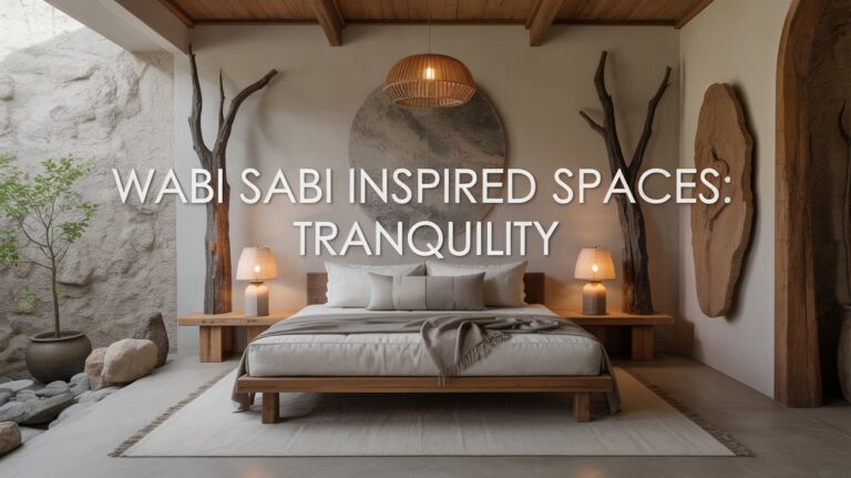
Curating Environments for Calm, Focused Practice
Curating environments for calm, focused practice means shaping spaces that quiet the mind and sharpen intention. You design with intention: reduce chaos, acknowledge imperfection, and invite quiet activity. Prioritize clean lines, tactile textures, and restrained color to support meditative mindfulness. Remove distractions, organize tools, and establish rituals that ground attention. Use natural light and deliberate acoustics to frame time, not overwhelm it. Allow sensory engagement to guide choices—soft textiles, subtle scents, quiet mechanisms—so focus isn’t forced but invited. In this balance, you create space where practice deepens, clarity emerges, and progress feels steady, tangible, and human.
Conclusion
You’ll find that balance isn’t polish without purpose. You embrace imperfect materials, letting texture and patina tell honest stories. You design interfaces that vanish into use, not scream for attention. You honor subtle flaws, transforming them into moments of meaning, while simplicity guides every layout and workflow. You choose colors and textures that age gracefully, and you craft interactions that feel quiet and kind. In this calm practice, you sustain focus, sustainability, and a humane, unhurried rhythm.