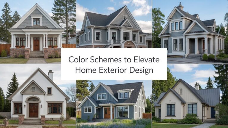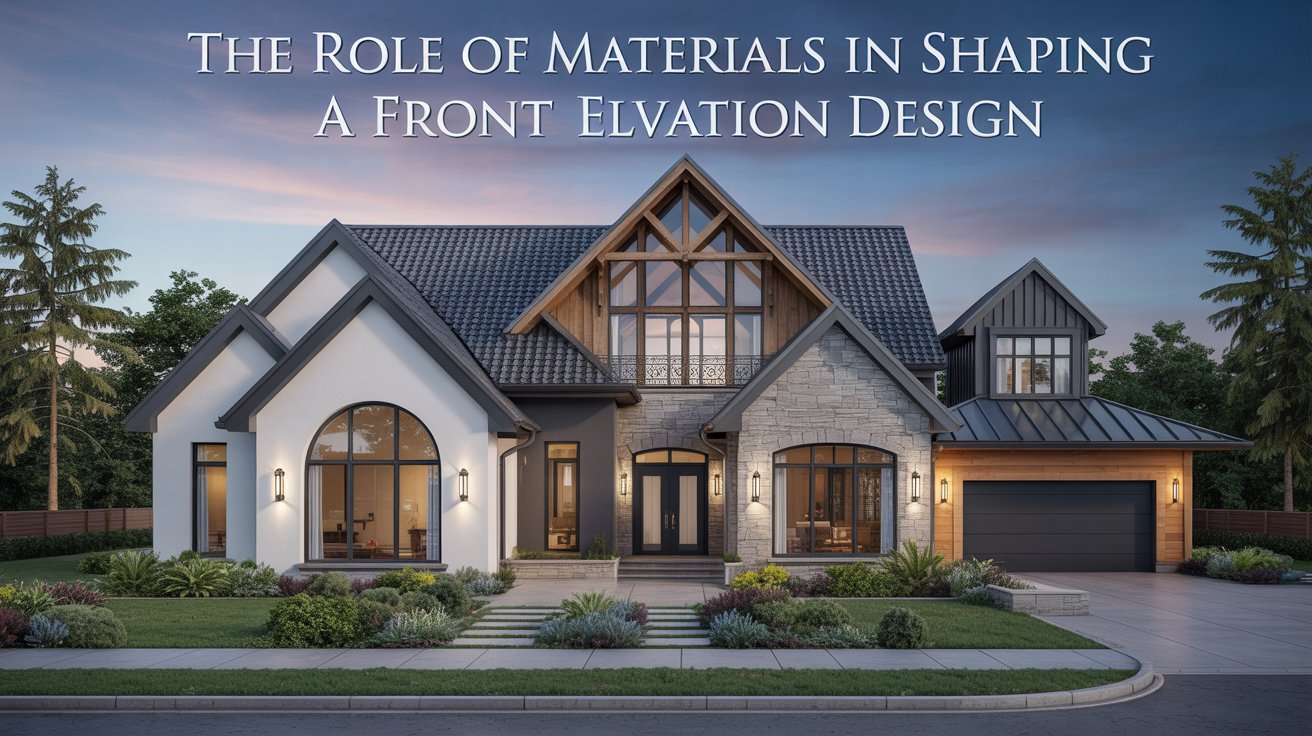
The Role of Materials in Shaping a Striking Front Elevation Design
I have been, or can be if you click on a link and make a purchase, compensated via a cash payment, gift, or something else of value for writing this post. As an Amazon Associate, I earn from qualifying purchases. Please read my full Affiliate Disclosure for more information.
Materials define the front elevation’s tone, texture, and legibility, guiding scale, shade, and rhythm with unmistakable cues. You’ll pair textures and finishes to reveal hierarchy, support mood, and meet durability goals. Color temperature shifts with natural light, while contrasting surfaces sharpen depth and form. Layering and grid alignment create readable tiers, anchoring openings and joints for clear wayfinding. With durable, low-maintenance finishes sourced responsibly, design stays legible over time. If you want more, you’ll uncover how each choice tightens the whole composition.
Key Takeaways
- Material choices set the character and perception of the façade through texture, color, and finish reads at varied distances.
- Durable, low-maintenance materials improve longevity and reduce future upkeep while maintaining a confident exterior appearance.
- Strategic layering, rhythm, and joint alignment create readable tiers and visual hierarchy on the front elevation.
- Climate-conscious selections and shading strategies optimize energy performance and comfort without compromising aesthetics.
- Environmental impact and local sourcing inform sustainable material decisions that support lifecycle performance and cost efficiency.
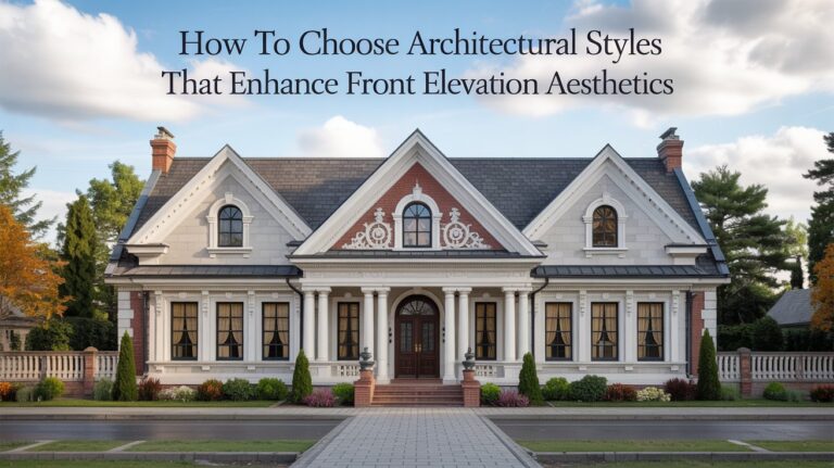
Material Selection and Mood
Material selection sets the mood of the front elevation by pairing textures, colors, and finishes to convey the building’s character. You assess material innovation options for exterior performance, durability, and assembly efficiency, aligning choices with design intent and budget. Visual precision matters: you document grain patterns, surface reveals, and joint lines, ensuring readability from typical viewing distances. Consider environmental impact early—life-cycle data, embodied energy, and local sourcing influence long-term sustainability. Balance contrast and harmony to guide perception of scale and massing. Document decisions with measurable criteria and reasoned tradeoffs, enabling repeatable outcomes and verifiable performance without compromising aesthetic clarity.
Texture, Color, and Light Dynamics
Texture, color, and light dynamics shape how a front elevation reads from distance to close-up, and they must be coordinated with the previously defined material performance and mood.
- Emphasize contrast ratios to reveal material symbolism at varying distances
- Align color temperature with natural light shifts for consistent perception
- Use ornamental detailing to articulate depth without clutter
- Calibrate highlights and shadows to enhance form without exaggeration
- Account for finish textures that read clearly under artificial illumination
This approach preserves clarity, enabling precise interpretation of texture and color as a coherent design language.
Layering, Rhythm, and Composition
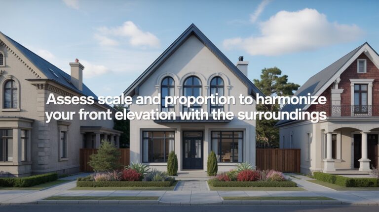
How do layering, rhythm, and composition coordinate to deliver a clear front elevation reading? You analyze how overlapping planes, staggered setbacks, and proportional shifts create readable tiers. Layering guides perception, while rhythm—through repetition, cadence, and contrast—teases the eye along the façade. Composition anchors these elements within a cohesive grid, aligning joints, openings, and material breaks to emphasize entrances and vistas. Use innovative accents to punctuate key axes without clutter, and maintain a strict visual hierarchy so the eye follows intended reading order. Precision detailing, material junctions, and scale decisions reinforce legibility, reducing ambiguity in architectural expression.
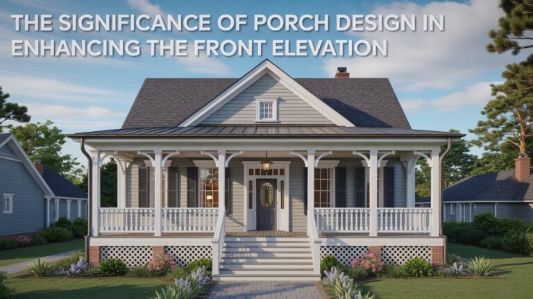
Durability, Maintenance, and Longevity
Durability, maintenance, and longevity hinge on selecting weathering-resistant materials and detailing joints to resist moisture ingress, freeze-thaw cycles, and UV degradation. You’ll evaluate how materials respond to daily and seasonal stresses, balancing aesthetics with performance, so you enable long-term color, texture, and form integrity. Focus on connections, sealants, and flashing, ensuring continuous rain screens where appropriate. You’ll integrate Decorative finishes and Material contrasts to sustain legibility of design over time without compromising durability. Plan for accessibility of maintenance, ease of cleaning, and replacement in place.
- Weathering resistance and joint detailing
- Sealant performance and flashing strategies
- Protective finishes and color stability
- Material contrast for clarity and aging
- Maintenance access and replacement pathways
Context, Climate, and Energy Performance
Building front elevations aren’t just about looks; they’re a live system that responds to site conditions, surroundings, and local climate. You assess wind exposure, sun path, and seasonal temperature shifts to predict performance. Context informs material selection, detailing how assemblies tolerate humidity, salt, or dust, while energy considerations guide shading, insulation, and thermal mass. Climate-responsive design leverages operable openings, daylighting, and low-heat-loss strategies. You prioritize durable, low-maintenance finishes from sustainable sources, balancing aesthetics with lifecycle impact. Innovative finishes add texture without compromising performance, and responsible sourcing supports long-term resilience. This approach yields visually striking elevations aligned with energy goals and environmental responsibility.
Conclusion
You’ll craft a front elevation that communicates its intent through material choice. Consider how texture, color, and light create perception and mood, guiding the eye along rhythm and layering. Balance durability and maintenance with longevity, ensuring detailing supports performance. Align with context and climate to optimize energy use and comfort. In every decision, prioritize composition that reads clearly from distance and up close, producing a coherent, visually precise façade that resists time and weather.