The Impact of Window Treatments on Sightlines, Light, and Ambiance in Living Rooms
I have been, or can be if you click on a link and make a purchase, compensated via a cash payment, gift, or something else of value for writing this post. As an Amazon Associate, I earn from qualifying purchases. Please read my full Affiliate Disclosure for more information.
Window treatments shape sightlines, control daylight, and set your living room’s mood by balancing exterior views with privacy and interior proportion through carefully chosen fabrics, hardware, and mounting. You’ll modulate glare and glare-driven hotspots with layered sheers and opaque panels, while fabric density and texture influence color fidelity and warmth. Mounting style and hardware finish tie the look to architectural language, sustaining rhythm across zones. If you keep exploring, you’ll uncover practical paths to cohesive ambiance and function.
Key Takeaways
- Layering opaque panels with sheers optimizes sightlines by balancing privacy with daylight and exterior views in living rooms.
- Fabric weight, weave, and texture determine light diffusion, glare control, and the room’s perceived warmth and color fidelity.
- Proper mounting and hardware coordination with trims create cohesive sightlines and prevent visual interruption while enhancing light behavior.
- Layered treatments offer flexible control for daytime openness and nighttime enclosure, improving ambiance and energy efficiency.
- Coordinated color, texture, and finish across fabrics and hardware establish a unified palette that supports room function and mood.
Understanding Sightlines and Window Treatments
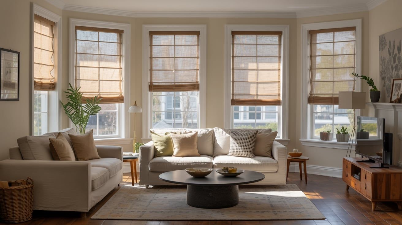
Understanding sightlines is essential when selecting window treatments, because unobstructed views and balanced interior proportions rely on how well your coverings frame and amplify exterior scenery. You evaluate sightlines by considering distance, glare, and focal points, ensuring curtains, blinds, or shades don’t obstruct artwork or landscape features. Consistent color coordination across elements strengthens rhythm, while window frame styles guide proportion and alignment with furniture. Choose treatments that preserve scale and allow controlled exposure to daylight. Technical precision matters: measure clearances, account for mullions, and test operation. This approach yields calm, functional rooms with expressive exterior dialogue.
How Fabrics and Textures Affect Light Quality
You’ll feel how light diffuses differently through fabrics, shaping ambiances from soft glow to crisp visibility. Texture adds glare control and tactile nuance, influencing mood and perceived warmth. Fabric density directly modulates light transmission, affecting privacy, color fidelity, and overall luminance.
Light Diffusion Qualities
Light diffusion is shaped by fabric weight, openness, and texture, which determine how much daylight is softened, tinted, or muted as it passes into a living room. You’ll notice lighter fabrics yield airy glow, while heavier weaves create warmer atmosphere; openness controls glare reduction and color shift, and texture adds micro-diffusion. This affects color coordination and perceived material durability, guiding your selections. Consider performance alongside aesthetics to preserve sightlines.
- Light attenuation varies with weave and fiber
- Color bias shifts with diffusion level
- Texture influences warmth and perceived durability
Texture and Glare
Texture and glare shape how daylight interacts with window treatments. You’ll notice how fabric patterns alter perceived brightness, with larger motifs creating focal points while minimizing uniform luminance. Textural variation—knits, weaves, and felts—diffuses light differently, shaping ambiance without changing exterior sightlines. Glare reduction depends on finishing, fiber orientation, and surface roughness; matte textures tend to soften reflections, while glossy surfaces amplify specular highlights. Consider material sustainability when selecting finishes, since longevity informs both performance and lifecycle impact. Balance pattern density with room function, ensuring comfort for tasks and viewing. Thoughtful texture choices optimize light quality, coherence, and visual calm.
Fabric Density Impact
Fabric density dictates how much daylight passes through and how it diffuses across a room. You’ll notice fabric density shapes glare, mood, and perceived brightness by altering material opacity and shadow quality. Higher density softens direct sun but can reduce overall light levels, while lower density preserves clarity and color accuracy with brighter, cooler diffusion. Consider how texture and weave influence diffusion patterns—not just color.
- Fabric density determines material opacity and daylight transmission
- Weave and pile modify light diffusion without changing color
- Density choices balance visibility, warmth, and ambiance
This approach supports precise light control and consistent sightlines.
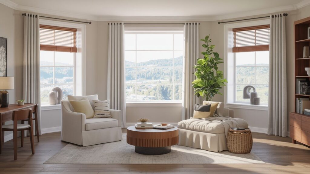
Layering Options for Privacy and Openness
You balance privacy and openness by layering solid drapes with light, translucent sheers, tuning visibility from street to sky. Start with opaque panels for daytime retreat and add sheers to preserve daylight while softening glare. This approach delivers controlled privacy alongside an airy, unobstructed feel.
Privacy Through Layers
Layering privacy in living rooms combines function and ambiance by using successive screens, sheers, and drapes that coexist with hardware and light control. You balance visibility with enclosure by selecting layered fabrics and operable hardware, optimizing sightlines and acoustics. The approach emphasizes soundproofing options and thermal insulation, reducing exterior intrusion while preserving daylight. Use combinations that trade texture for privacy without sacrificing airiness.
- Integrate dense-underlining panels with sheer overlays
- Pair blackout linings with acoustic liners
- Schedule active and passive layers to adapt to time of day
Openness With Sheers
Openness with sheers builds on layered privacy by introducing light, air, and visual continuity. You’ll experience a softened skyline silhouette while maintaining control over sightlines from within. Sheers diffuse direct glare, reducing harsh contrasts without fully closing the window to the outdoors. Pairing them with blackout or denser drapery allows rapid adjustments between openness and privacy, optimizing daily rhythms. The result supports solar gain when desired and preserves daylight quality, while preserving energy efficiency through controlled heat transfer. This approach emphasizes textiles that balance weight, weave, and fiber, ensuring a crisp, breathable look that enhances room atmosphere and functional flexibility.
Mounting Styles and Architectural Harmony
Mounting styles should align with the room’s architectural language, ensuring hardware and installations read as an intentional part of the design rather than an afterthought. You’ll shape harmony by coordinating mounting method with visual weight, line, and material palette. When you integrate drum shades and window frame elements, aim for seamless continuity, not interruption. The result is a cohesive silhouette that enhances sightlines and light behavior.
- Align hardware finish with trim and molding
- Prefer concealed or recessed mounting for clean lines
- Use drum shades to echo frame proportions and scale
Balancing Ambiance With Function: Entertaining, Relaxing, Working
Balancing ambiance with function means tailoring light and texture to how the room will be used: entertaining, relaxing, and working alike. You adjust window treatments to modulate glare during presentations, while preserving intimate sightlines for conversation. Color coordination guides the palette of fabrics and shades, ensuring contrast supports focus without overwhelming mood. Consider how sheer layers soften daylight for relaxing areas, yet permit controlled brightness for working tasks. Material durability matters: choose robust weaves and hardware that withstand frequent handling and guest use. Efficient layering achieves versatility, maintaining cohesion across zones without sacrificing comfort, privacy, or visual clarity.
Practical Tips for Coordinating Window Treatments With Room Color and Style
When coordinating window treatments with room color and style, start by identifying the dominant hue and undertones in walls, furniture, and flooring, then select fabrics and hardware that echo or complement those tones. Aim for color coordination that reinforces a cohesive palette and reinforces style consistency across textures and finishes. Choose sheers or solids that balance bold accents, ensuring light control without clashing. Consider proportion to window size and ceiling height to preserve sightlines and rhythm.
- Harmonize textile weights for depth and balance
- Align hardware finishes with metal or wood tones
- Maintain consistent color temperature for ambiance
Conclusion
In sum, your window treatments shape sightlines, light quality, and ambiance with precise, measurable impact. You’ll optimize privacy and openness through thoughtful layering, while fabrics and textures modulate color warmth and glare. Mounting styles should harmonize with architecture, not compete with it. When you balance function and mood—entertaining, relaxing, or working—done-right, you’ll preserve room cohesion. Coordinate treatments with existing color schemes and style cues, using controlled textures and subtle contrasts to elevate every living space.