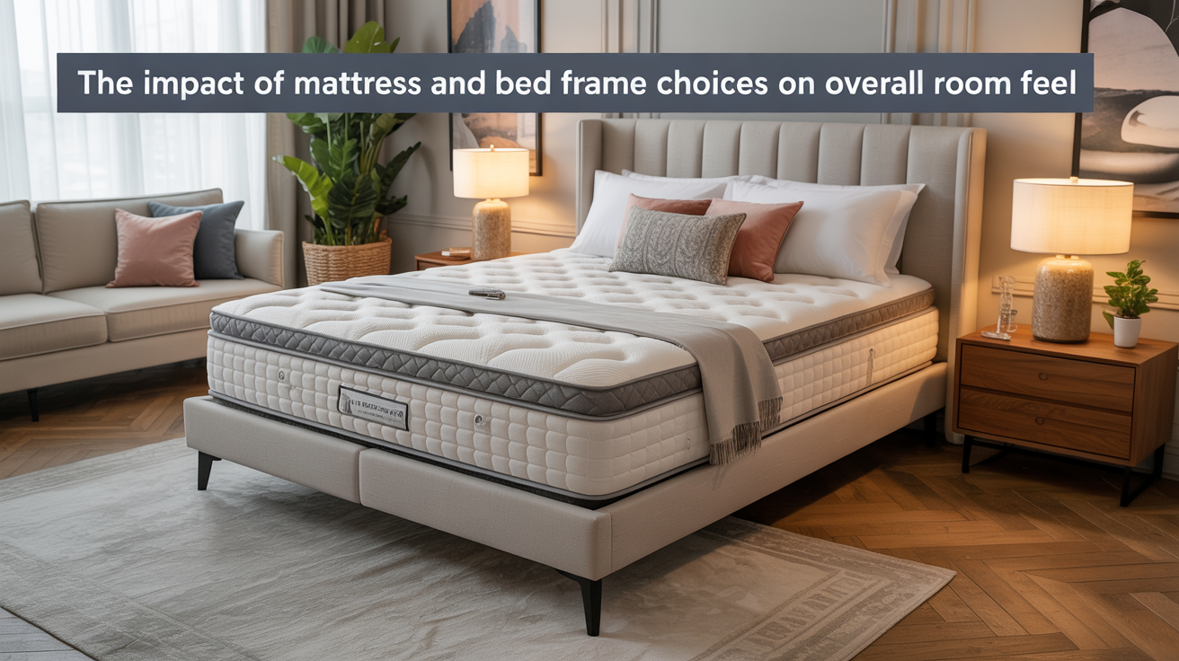
The Impact of Mattress and Bed Frame Choices on Overall Room Feel
I have been, or can be if you click on a link and make a purchase, compensated via a cash payment, gift, or something else of value for writing this post. As an Amazon Associate, I earn from qualifying purchases. Please read my full Affiliate Disclosure for more information.
Your mattress and bed frame shape more than comfort—they set the room’s scale, texture, and mood. A supportive mattress aligns your spine and boosts sleep quality, while the frame’s size, color, and finish influence perceived room weight and harmony. Materials and upholstery add warmth or edge, and height with clearance affect flow and safety. When these elements echo your walls and accents, the space feels cohesive and calm. Keep reading to explore how to optimize this balance.
Key Takeaways
- Mattress support shapes spinal alignment and sleep quality, influencing perceived comfort and room coziness.
- Bed frame design and visual weight affect room balance, proportion, and the bed’s presence as a focal point.
- Materials, textures, and finishes set the room’s tactile feel, durability, and overall style cohesion.
- Height, clearance, and safety determine circulation ease and the bed’s functional integration with the space.
- Color coordination between mattress, frame, and palette reinforces harmony and room perceived unity.
Assessing How Mattress Comfort Shapes Sleep Quality and Body Alignment

A comfortable mattress directly shapes how well you sleep and align your spine throughout the night. You’ll notice how sleep posture improves when your body sits evenly, supported by balanced pressure distribution. Mattress firmness matters: too soft, and you sink, misaligning your hips and shoulders; too firm, and you feel pressure points that interrupt rest. Find a middle path that maintains natural curves while stabilizing your torso. Your nightly alignment hinges on adequate receptivity to contours and responsive support. With careful testing, you identify a firmness level that harmonizes comfort with spinal integrity, empowering deeper, more restorative sleep.
How Bed Frame Design Affects Room Scale and Visual Cohesion
Your bed frame sets the room’s visual weight, so the frame’s mass, lines, and finish shape how you perceive space. When you choose proportionate scale, the frame doesn’t overpower or vanish, it harmonizes with the room’s dimensions. Consider how visual weight and proportion guide cohesion across furniture, texture, and color for a unified look.
Visual Weight of Frames
The visual weight of a bed frame sets the room’s hierarchy, guiding how you perceive space and balance. When you choose a frame, its silhouette and lines establish visual weight balance across the room, influencing how other elements read next to it. For symmetry, bed frame symmetry creates calm order, making the bed feel anchored rather than floating. Conversely, a lean or oversized frame can disrupt balance, squeezing surrounding furniture. Consider material, color, and leg visibility, which modulate presence without crowding. Clear alignment between headboard, nightstands, and wall art reinforces cohesion and a unified, comfortable atmosphere.
Proportion and Scale Harmony
Proportion and scale work together to ground a room’s feel: a bed frame that harmonizes with ceiling height, wall dimensions, and nearby furniture makes the space read as deliberate rather than crowded. You’ll notice balance when the headboard doesn’t overwhelm or underwhelm; the frame should align with proportions of the room, not fight them. Consider bed frame materials to assure visual weight matches other elements, preventing discord. Pairing mattress color coordination with frame tone reinforces cohesion, guiding eye flow. When scale is respected, you gain clarity, ease, and a sense that every piece belongs, enhancing overall calm and perceived intentionality.
Materials and Textures: From Upholstery to Frame Finishes
Materials and textures shape how a mattress setup feels and functions, from the upholstery you touch to the frame finishes you glimpse. You’ll notice fabric patterns influence warmth, airflow, and visual weight, while frame finishes alter perceived sturdiness and style. Choose tight-weave fabrics for durability and easy cleaning, or boucle for coziness under softer lighting. Metals, Wood, andlaminate options each convey different character; match them to room palette to avoid clashing accents. Consider grain direction and seam density for long-term wear. When you test beds, compare tactile response, edge support, and how finishes reflect the room’s overall mood.
Height, Clearance, and Safety: Practical Sleep Space Considerations
Height, clearance, and safety shape how you enter, use, and move around your bed. You consider bed height to fit your routine, room height, and leg comfort, avoiding awkward bends. Safety clearance matters: guarantee space to move, tidy around, and access essential surfaces without tripping hazards. Choose a frame that keeps the mattress stable, reducing roll-offs on uneven floors. For safety, verify edge accessibility, guardrails if needed, and proper anchoring to walls or foundations. You’ll appreciate a bed that aligns with your height, offers ample floor space, and minimizes obstruction, supporting steady nightly transitions and safer daytime activities.
Color Coordination: Aligning Mattress Tone With Room Palette
Color matters: your mattress hue should echo or softly offset the room’s palette, creating cohesive harmony across the space. Start by identifying a dominant tone in your palette, then align the mattress color to that hue or opt for a complementary shade to avoid clashing. This Palette-Tone Alignment sets the stage for balanced textures and visual flow throughout the room.
Mattress Hue Harmony
When selecting a mattress Hue Harmony, you’ll aim for a tone that neatly echoes or pleasantly contrasts your room palette, guiding mood without shouting. You’ll choose surface color and texture that harmonize with your walls and accents, prioritizing calm, cohesive vibes over loud contrast. Consider the visual weight of your mattress against furniture and flooring, noting whether lighter or darker tones enhance balance. Practical considerations matter: neutral shades support versatility, while subtle color peeks can add depth. Remember bed linen and storage solutions should reinforce harmony, avoiding busy patterns that clash with the main palette. Aim clarity, restraint, and purposeful cohesion.
Palette-Tone Alignment
If you want seamless harmony, start by mapping your mattress tone to the room’s palette so it either echoes key hues or plays a calm counterpoint. Palette-Tone Alignment guides how you balance color, texture, and weight, ensuring the bed reads as an intentional focal point. Consider bed frame craftsmanship and mattress material selection together, so the finish and fabric support mood, not just function. Your choices influence perception of space, light, and cohesion.
- Align frame finish with dominant wall or flooring tones
- Choose mattress textures that repeat room accents
- Prioritize durable materials for lasting harmony
Acoustic and Spatial Effects: Quieting Nighttime Noise and Reducing Clutter
Strategically arranging your mattress and bed frame can quiet nighttime noises and trim visual clutter, creating a calmer sleep environment. You’ll notice acoustical improvements when you position the headboard away from shared walls and use solid, non-resonant materials. Implement soundproofing techniques like thicker underlayment, padded headboards, and compliant frame supports to dampen impact sounds and hallway noise. Choose low-profile frames to reduce reflections and hidden crevices that collect dust. Spatially, keep pathways clear and limit bulky furniture near the bed to minimize visual clutter. This approach supports bedroom noise reduction and a more serene, restorative atmosphere.
Practical Tips for Harmonizing Comfort, Style, and Freshness
To balance comfort, style, and freshness, start with a clear plan that blends plush textures, cohesive color, and practical upkeep. You’ll harmonize space by selecting bed linen textures that feel inviting and endure daily use, then pair them with a calm palette to avoid visual clutter. Consider ambient lighting choices that enhance mood without overpowering texture. Keep storage simple and accessible to maintain freshness. Focus on rhythm between soft surfaces and clean lines, ensuring easy maintenance.
- Choose durable bed linen textures that maintain softness after washing
- Align ambient lighting choices with task and mood zones
- Implement weekly tidying rituals to preserve calm appeal
Conclusion
You’ll feel the difference when comfort meets design. Prioritize a mattress that supports your spine, then choose a frame that suits your space without overpowering it. Let textures, finishes, and color cues weave a cohesive vibe, while height and clearance keep your room practical and safe. Consider acoustics and clutter-shedding as part of the plan. When comfort and style align, your bedroom becomes a harmonious retreat that stays fresh, functional, and visually balanced.