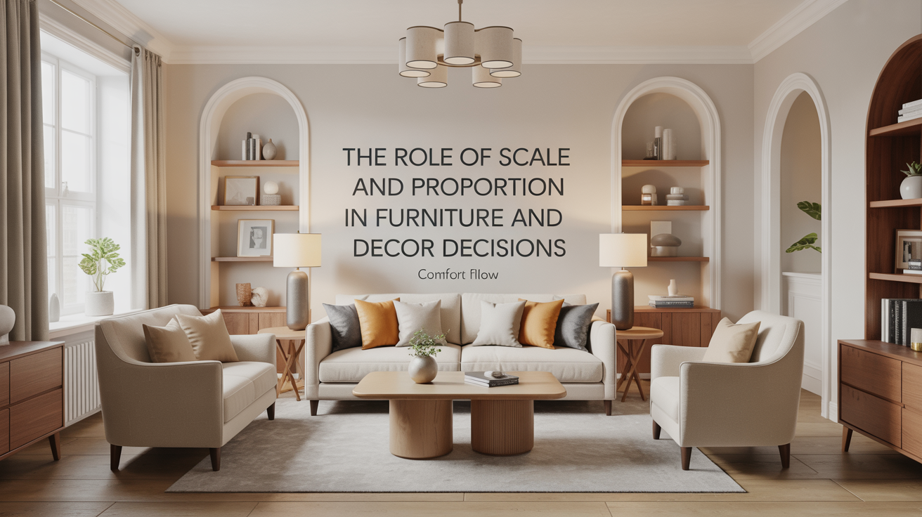
The Role of Scale and Proportion in Furniture and Decor Decisions
I have been, or can be if you click on a link and make a purchase, compensated via a cash payment, gift, or something else of value for writing this post. As an Amazon Associate, I earn from qualifying purchases. Please read my full Affiliate Disclosure for more information.
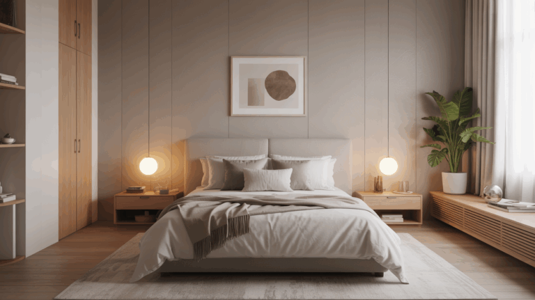
Scale and proportion govern how your furniture and decor read in a space, shaping comfort, flow, and visual balance from the first glance. You measure room footprints and furniture footprints to establish a coherent rhythm, ensuring major silhouettes align with the room’s scale. Consider sightlines, clearance, and weight balance so pieces don’t overpower or crowd. Color and texture unify disparate styles, guiding shifts. If you keep refining these cues, you’ll open richer spatial clarity and cohesion beyond the basics.
Key Takeaways
- Scale ensures furniture fits the room’s dimensions and flow, preventing crowding or emptiness while supporting comfort.
- Proportion links silhouettes, weights, and silhouettes of pieces for visual harmony and cohesive rhythm.
- Clearances (24″ seating, 18″ from walls) and sightlines guide practical, balanced layouts.
- Material and color balance unify different styles, maintaining clarity and preventing competing elements.
- Start with precise measurements and test under lighting to confirm consistent proportion and visual weight.
Understanding Scale: How Size Affects Room Feel
Understanding scale matters because it shapes how a space is perceived and how comfortably you move within it. When size relationships align with function, you’ll notice improved flow and usability. You assess furniture proportion, ceiling height, and walk paths to prevent crowding or emptiness. Color contrast guides visual weight, highlighting focal points without overwhelming the eye. Material texture modulates tactile and acoustic perception, influencing comfort as you navigate a room. You’ll prefer items that read as unified yet distinct, avoiding abrupt shifts in scale. Precise measurement, informed by purpose, yields predictable, human-centered environments.
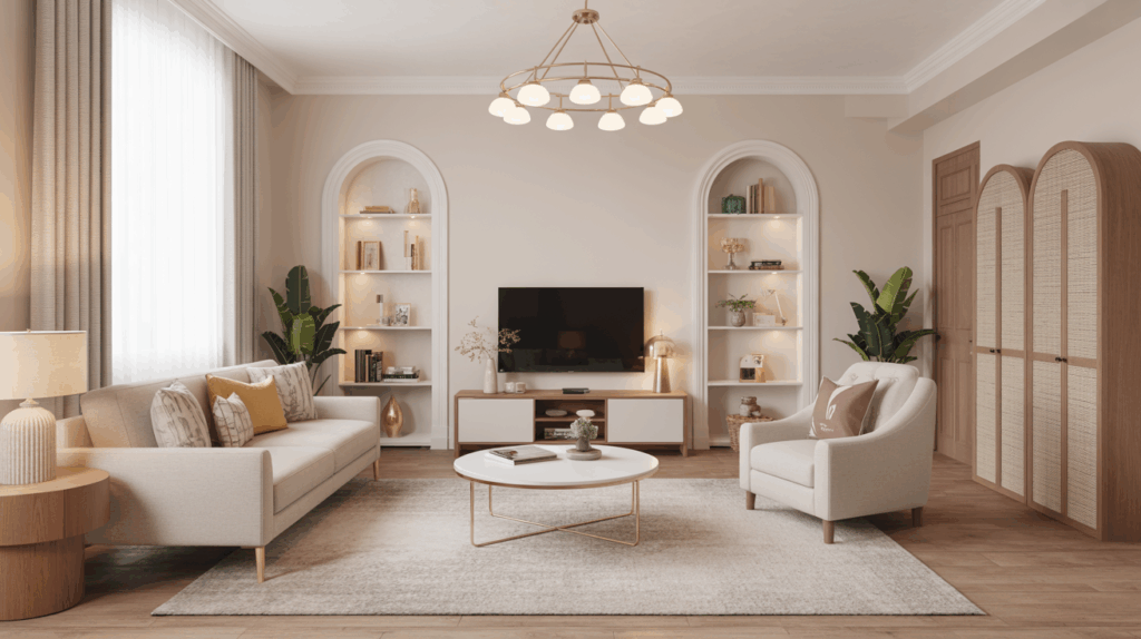
Proportion and Harmony: Balancing Shapes and Silhouettes
When shapes and silhouettes relate through proportional rules, furniture reads as a cohesive unit rather than a collection of parts. You achieve harmony by aligning major silhouettes with the room’s scale and ensuring consistent rhythm across pieces. Focus on silhouette weight, curve versus angularity, and reflexive repetition to guide perception. Color harmony should reinforce proportion, using a restrained palette that echoes material tones rather than competing with forms. Material balance matters: lighter upholstery with solid frames or vice versa creates steadiness without visual overload. Fine-tune relationships through subtle adjustments, maintaining clarity, precision, and purpose in every selection.
Measuring Space: Visual Cues for Furniture Fit
Visual cues guide furniture fit by translating room dimensions into practical layouts; you can read space through sightlines, clearance allowances, and the rhythm of movement.
- Observe color contrast and material texture to delineate zones and anticipate glare or muted areas.
- Measure clearance paths: at least 24 inches around seating, 18 inches from walls to avoid contact, and door swing allowances.
- Compare furniture footprint to visual scale, confirming proportion with line-of-sight reveals and furniture grouping balance.
This approach remains technical, precise, and thoughtful, enabling accurate decisions about scale while supporting a calm, legible environment.
Pairing Pieces: Creating Cohesion Across Styles
Pairing pieces across styles hinges on a disciplined approach to contrast, harmony, and proportion. You assess each item’s silhouette, weight, and finish, then align these elements to avoid visual competition. Establish a unifying thread—be it a shared color family, texture, or form language—and let it anchor decisions without stifling individuality. Color coordination serves as the primary cohesion tool, guiding progressions between eras or genres. Material contrast adds depth when used deliberately, balancing tactile interest with visual calm. Maintain scale compatibility so statement pieces don’t overwhelm surrounding furniture, ensuring seamless interaction across styles while preserving room rhythm and legibility.
Practical Tips: Applying Scale and Proportion in Real Rooms
Applying scale and proportion in real rooms starts with a clear measurements mindset: know the room’s floor area, ceiling height, and the practical footprint of each piece, then match them to create balanced relationships rather than crowded, overbearing arrangements. You’ll prioritize color coordination and material textures to unify disparate items. Use a three-step approach:
1) Assess dominant planes and adjust height and width to maintain rhythm;
2) Align furniture with sightlines, ensuring balance from primary seating to focal points;
3) Test textures and hues in lighting to preserve coherence under changing conditions.
Conclusion
In summary, you’ll recognize that scale governs perceived room size, while proportion ensures cohesive silhouettes. You’ll measure space with visual cues and translate those measurements into furniture that fits without crowding. You’ll pair pieces to harmonize styles, balancing dominant lines with supporting motifs. By applying precise ratios and thoughtful contrast, you’ll achieve rooms that feel intentional and comfortable, where every element relates to the whole. With careful checks, scale and proportion guide durable, aesthetically satisfying decisions.