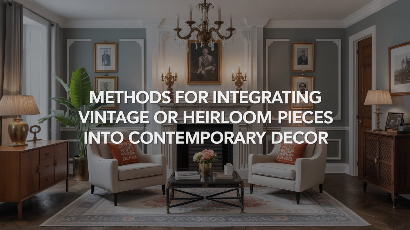
Methods for Integrating Vintage or Heirloom Pieces Into Contemporary Decor
I have been, or can be if you click on a link and make a purchase, compensated via a cash payment, gift, or something else of value for writing this post. As an Amazon Associate, I earn from qualifying purchases. Please read my full Affiliate Disclosure for more information.
To integrate vintage or heirloom pieces into contemporary decor, start with a clear inventory and intent, treating items as characters in your space. Balance scale and proportion so antique pieces sit comfortably with modern silhouettes, and pair rough textures with smooth finishes for tactile harmony. Share provenance through careful lighting and placement, highlighting restoration details. Respect patina while embracing purposeful upgrades with discreet hardware. If you want more nuanced tactics, you’ll discover additional strategies as you continue exploring the approach.
Key Takeaways
- Assess and label items as antique inspiration or keepsakes to guide placement and storytelling in your space.
- Use scale and proportion to ensure vintage pieces harmonize with modern silhouettes without visual competition.
- Create material balance by pairing rough textures with smooth surfaces and balancing warm/cool tones.
- Build a cohesive narrative by linking provenance, era, and maker to display moments and lighting.
- Embrace patina and careful, reversible upgrades, documenting changes to preserve provenance while updating function.
Assessing Your Collection: Inventory and Intent
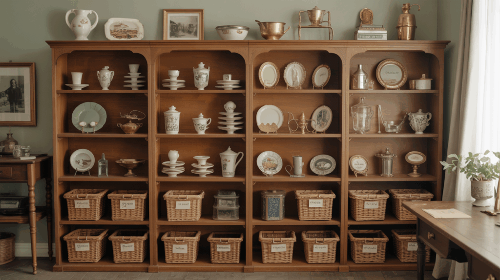
Begin by taking stock of what you have and why you bought it in the first place. You’ll assess each piece for relevance, condition, and emotional pull, labeling items as antique inspiration or necessary keepers. Create a simple inventory: item, provenance, date, and any notable flaws. Consider how pieces contribute to stories you want your space to tell, and which belong in heirloom preservation rather than display solely for trend. Note scale, function, and potential for restoration. This clarity helps you set priorities, plan protective measures, and avoid clutter. Your intent guides placement, pairing, and future acquisitions with intentional, cohesive decor.
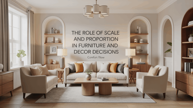
Finding the Right Balance: Scale, Proportion, and Placement
You’ll notice how scale sings when a vintage piece sits beside modern silhouettes, each echoing the other in size without shouting. Proportion becomes intentional rhythm, guiding eye movement from bold centerpiece to quieter accents. Placement then seals the balance, framing stories across the room with purpose rather than accident.
Scale in Harmony
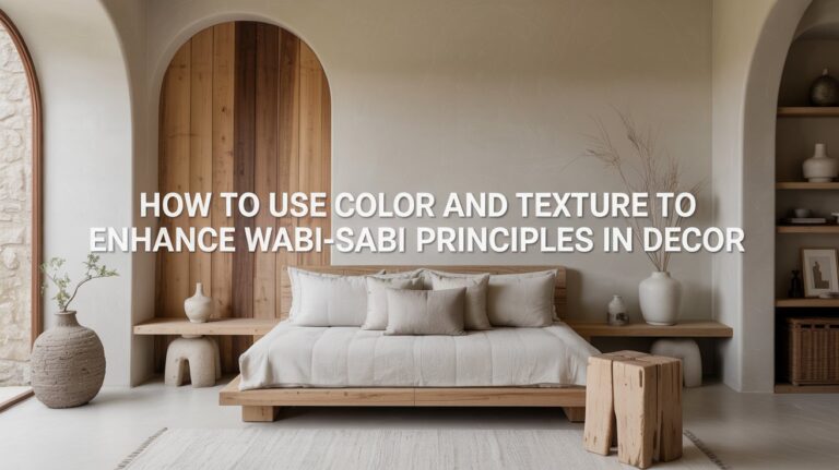
Finding the right balance between vintage charm and modern ease hinges on scale, proportion, and placement; when furniture and décor speak in measurements that fit the room, the heirloom piece feels intentional rather than crowded. You’ll judge scale by the chair’s silhouette, the cabinet’s footprint, and the rug’s reach, ensuring every element breathes. Pair antique furniture with streamlined frames to avoid visual competition, and let proportion guide table heights and seating distances. Place a single statement piece confidently, then echo its energy with complementary textures like heirloom textiles. This careful tuning preserves character while inviting everyday use.
Proportion With Purpose
Proportion with purpose means letting scale guide every choice so that vintage pieces feel deliberate, not dominant. You balance objects by considering room dimensions, ceilings, and furniture profiles, letting larger items anchor a space while smaller accents breathe around them. Seek cohesion through repetition of color, texture, or line, and place pieces where their silhouette complements the eye’s path. Test sightlines from diverse angles, adjusting to avoid crowding or scarcity. In antique restoration, precision matters; in modern reinterpretation, restraint heightens impact. Your goal: objects that read as intentional, integrated, and enduring.
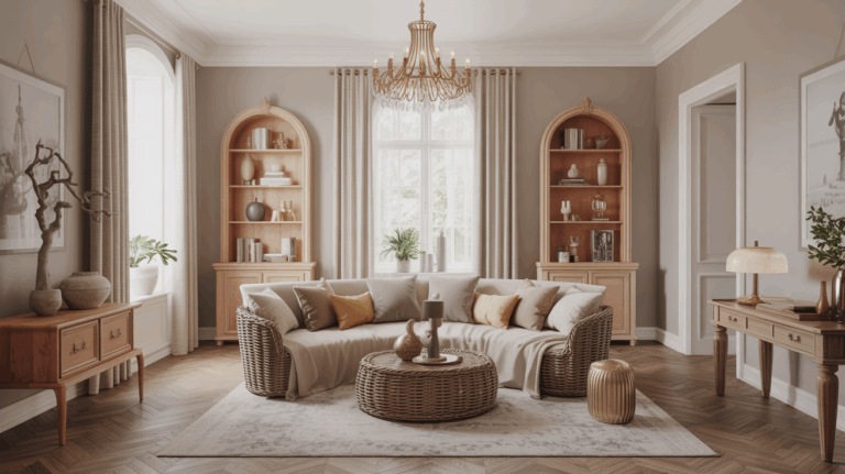
Material Harmony: Textures, Finishes, and Color Contrast
You’ll explore how Texture Pairing Balances tactile extremes, pairing rough-weave with smooth surfaces to keep your space unified. Finish Contrast Cues guide you to mix patina and sheen without shouting, using subtle shifts to anchor vintage pieces in a modern setting. Color Harmony Rules help you thread warm and cool tones, so every piece feels intentional rather than accidental.
Texture Pairing Balance
Texture pairs are the quiet dialogue of a room: balance tactile variety with a cohesive finish so that rough meets smooth, glossy meets matte, and warm woods converse with cool metals without competing.
- antique accents harmonize textures without overpowering
- heirloom integration uses subtle patina to unify materials
- balanced scale keeps contrast intentional, not chaotic
You’ll notice texture balance guides eye flow, anchoring vintage pieces within modern lines. Embrace material variety as a language, not a clash, letting soft fabrics counter hard surfaces and matte tones temper gloss. With thoughtful pairing, textures whisper rather than shout, creating cohesion that feels collected, not contrived.
Finish Contrast Cues
Finish contrast cues emerge when you treat textures, finishes, and color as three colors on a single palette. You align surface elements by measuring how finish differences read on sight and touch, then balance them against form. Consider finish contrast cues: a satin wood top against a matte metal base, or a high-gloss ceramic with a weathered wood frame. Let surface sheen guide you, not overpower. Pair shiny with muted, then repeat the rhythm across rooms to create cohesion. When done well, the interplay of texture and sheen clarifies hierarchy, inviting quiet emphasis rather than loud competition.
Color Harmony Rules
Color harmony is really about how textures, finishes, and color contrast work together as a unified material language. You balance color contrast with intentional hue coordination, so vintage pieces feel cohesive rather than competing accents.
- Align warm and cool tones to prevent jarring clashes
- Mix matte and gloss finishes to add depth without shouting
- Reference a shared color family across textiles, wood, and metal
Curating Provenance: Storytelling Through Display
Weave a clear through-line of each piece’s origin by situating it within the room’s broader narrative: don’t just place objects, curate their stories. You’ll frame provenance as a conversation, not a catalog, linking era, maker, and meaningful moments. Highlight what restoration challenges reveal about technique and care, without diluting its essence. When you display, pair pieces with notes that illuminate cultural significance, and invite questions without over-explanation. Let lighting, lines, and placement guide the eye toward interpretation, not nostalgia alone. A thoughtful vignette clarifies how every heirloom enriches contemporary living, transforming a room into a living archive.
Preservation vs. Modernization: Patina, Repairs, and Upgrades
Patina isn’t just age—it’s testimony, and you’ll want to read it before you rewrite the piece. You balance preservation with modernization by honoring patina while planning purposeful upgrades. With patina preservation in mind, you decide what to keep, restore, or let breathe. Repairs should be functional, not cosmetic cover-ups, and upgrade choices must respect character, material, and scale.
- Prioritize reversible repairs and signal durability
- Use discreet, period-appropriate hardware for upgrades
- Document changes to preserve provenance and intent
Your goal: meaningful continuity, refined by intention, clarity, and thoughtful alteration.
Styling Techniques: Grouping, Focal Points, and Lighting
As you blend vintage pieces with contemporary decor, grouping, focal points, and lighting become the story you tell with intent. You’ll curate vignettes through deliberate grouping, using varied heights and textures to guide the eye. Establish a visual hierarchy with a clear focal point, then support it with complementary elements and negative space. Lighting techniques shape mood and highlight details—consider layered light, from ambient to task to accent, to sculpt texture and color. Framing strategies matter: align sockets, art, and surfaces for cohesive rhythm. Purposeful placement guarantees cohesion, while authenticity remains at the center of every curated moment.
Practical Transitions: From Vintage Npieces to Contemporary Everyday Use
When you blend vintage items into daily life, practical shifts hinge on gentle reimagining rather than wholesale replacement: keep the piece approachable by adapting its function, scale, and context to today’s rhythms.
- Embrace restoration techniques to stabilize wear while preserving character.
- Compare vintage vs modern uses, then thoughtfully reassign roles (lamp becomes ambient light, cabinet stores modern essentials).
- Simplify objects with updated finishes, hardware swaps, and concealed cords for clean integration.
Conclusion
You’ve done the hard work: cataloging, balancing, and storytelling. As you integrate vintage pieces into modern spaces, let restraint be your guide—select a few anchors, not a museum. Match textures and finishes, honor patina, and gently upgrade only where it serves function. Group thoughtfully, light with intention, and let provenance breathe without shouting. When in doubt, pause, reassess, and adjust. Your space will feel cohesive, lived-in, and forever current—where yesterday’s charm enhances today’s daily life.