Layering Color Palettes: Coordinating Walls, Upholstery, and Accessories
I have been, or can be if you click on a link and make a purchase, compensated via a cash payment, gift, or something else of value for writing this post. As an Amazon Associate, I earn from qualifying purchases. Please read my full Affiliate Disclosure for more information.
Anchor your space with a core hue, then layer supporting tones across walls, upholstery, and accessories for cohesion. Ground walls with undertones that echo fabric palettes, and use subtle shifts in value and finish to deepen depth. Balance bold statements with softer neutrals, repeat core hues, and vary textures—matte walls, tactile upholstery, glossy trims. Let layering fabrics, lighting, and color blocks guide rhythm and zones. Want more pointers that keep this timeless? You’ll find them as you continue.
Key Takeaways
- Choose wall colors that complement upholstery undertones to create a cohesive, unified feel across the space.
- Layer neighboring hues with subtle value and saturation shifts for depth and visual journey.
- Balance bold patterns with calmer walls to preserve harmony and maintain proportion with room scale.
- Use texture and finishes (matte, satin) to influence hue perception under varied lighting.
- Repeat subtle undertones across fabrics, trims, and accessories for consistent color storytelling.
Guiding Hue: Establishing Your Core Color
Choosing a guiding hue is about anchoring your palette with a color that feels inherently right for the project. You select a core hue that aligns with mood, light, and function, then build around it. Monochrome schemes offer clarity, letting subtle shifts in value define cohesion without clutter. Color blocking reinforces rhythm, pairing bold, solid fields with quieter neighbors to establish balance. You’ll test warmth and coolness to ensure harmony across walls, upholstery, and accessories, keeping the core hue visible but adaptable. Clarity comes from restraint: define the core, then layer neighboring tones for depth, not distraction.
Building Supporting Tones for Depth
Building supporting tones is about depth, not drama; you layer neighbor hues to ground the core color. You’ll weave subtle shifts in value and saturation across walls, upholstery, and accessories, creating a cohesive journey for the eye. Focus on textural contrast to add interest without competing with the dominant tone, using matte, satin, and tactile finishes to deepen perception. Use tonal gradations to guide movement: lighter cushions, mid-tone throws, darker accents, all harmonizing with the base. Keep palettes narrowly spaced so neighbors feel connected, not clashing. The result is refined depth that reads as layered, intentional, and effortlessly unified.
Balancing Bold Statements With Soft Neutrals
You’ll balance bold statements with soft neutrals by pairing a striking hue with calm, muted tones to ground the palette. Start with a dominant color, then layer neutral accents to temper intensity and keep the look cohesive. Use the Soft-Neutral Balance to let Bold With Restraint guide contrast, texture, and mood across the design.
Soft-Neutral Balance
Soft neutrals act as a quiet counterbalance to bold statements, letting color pops breathe without compete. In this balance, you approach palettes with intention: the soft hue grounds walls, while bolder accents sing. When you plan furniture placement, you create rhythm: group chairs to frame color moments, avoid crowding, and leave breathing space around daring pieces. Window treatments softly layer texture and light, enhancing the neutral canvas without overpowering the statement colors. Aim for cohesion by repeating subtle undertones across fabrics, finishes, and trims. This discipline keeps your room inviting, purposeful, and visually calm, even with striking color accents.
Bold With Restraint
Bold can shine, but restraint keeps it from shouting; balance rests on soft neutrals that ground and soothe. You’ll pair bold statements with quiet backdrops, letting color do the talking without overwhelming the room. Use subtle contrasts—deep ink, warm taupe, and crisp white—to create focal moments that feel intentional, not loud. Textures matter: matte finishes against a satin accent wall soften the impact. Keep patterns minimal and sizes varied to maintain rhythm. When in doubt, step back and assess harmony before adding another color.
- Emphasize bold statements with restrained surroundings
- Layer with subtle contrasts for cohesion
- Prioritize balance over saturation
Texture as a Vehicle for Color
Texture isn’t just surface; it acts as a channel for color, shaping how hue reads under different light and touch. You feel depth through texture, and that depth changes perception, making color choices more flexible. Use textural contrast to create visual rhythm: pair smooth, matte walls with tactile upholstery, so color shifts feel intentional rather than incidental. Fabric layering adds dimensionality, allowing you to stack tones without overwhelming the room. Choose fabrics that carry the same family value—vary weight, weave, and sheen to reveal subtle shifts. Result: cohesive color storytelling that remains crisp, purposeful, and easy to refine over time.
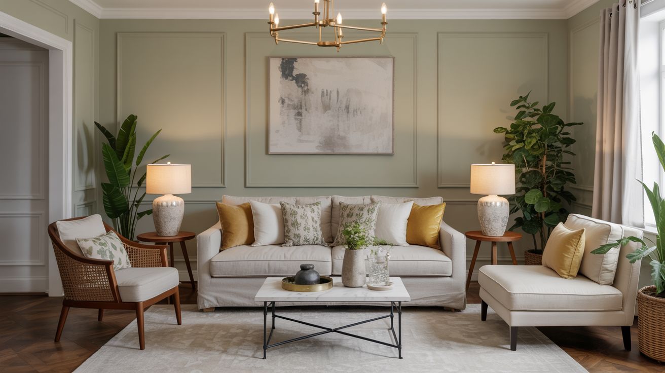
Coordinating Walls With Upholstery
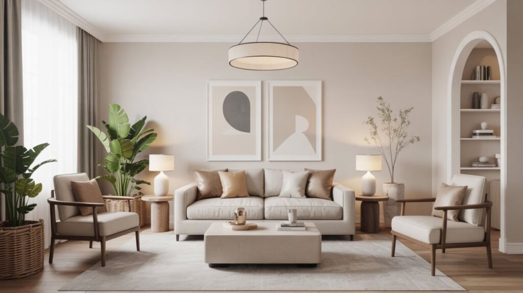
When you coordinate wall color with upholstery, aim for harmony between wall hues and fabric undertones for a unified room feel. Use contrast judiciously to create focal points—think a bold sofa with a softer wall shade or a subtle pattern that ties both together. Consider scale and mood to balance energy, so wall color and fabric work as one cohesive palette.
Wall-Color and Fabric Harmony
A well-balanced wall color sets the stage for your upholstery, so start with a hue that complements the fabric’s undertone and saturation. You’ll create harmony by aligning undertones, not chasing exact matches, then let paint finishes influence depth and mood. Translate this toward fabric patterns by selecting a wall shade that supports the pattern’s scale and contrast without competing.
- Choose a wall color that echoes the fabric’s undertone to unify the room
- Consider paint finishes (matte, satin, gloss) for depth and tactile feel
- Balance bold patterns with calmer walls to preserve cohesion
This approach keeps your palette cohesive and approachable.
Contrast and Cohesion Tips
Even with bold upholstery, you can maintain cohesion by anchoring walls in a complementary, not competing, shade. To contrast without clash, aim color blocking that defines zones while keeping a shared backbone. Choose a wall tone that echoes the upholstery’s undertone, then layer with accessories in two supporting hues for depth. Embrace monochromatic schemes for quiet tension, using variations in lightness rather than hue changes. Balance matte walls with satin or subtle gloss accents to reflect light without shouting. Keep the palette tight, test swatches in real rooms, and select furnishings that reinforce unity through consistent temperature and saturation.
Scale and Mood Balance
Scale the walls to match the room’s upholstery without shrinking the mood. You’ll balance scale by pairing proportionate panels with larger prints or calmer textures, ensuring the wall acts as a backdrop, not a rival. Aim for harmony, letting scale guide mood modulation across elements. When walls breathe, upholstery can energize without shouting learning from the palette.
- Maintain proportional relationships between wall area and fabric pattern
- Use neutrals or soft backdrops to support bold furniture without overpowering it
- Check rhythm across textures so scale harmony feels intentional, not accidental
Accents That Dance With Layered Depth
Accents that dance with layered depth hinge on small, intentional contrasts—like a pop of warmth against cool undertones or a metallic glint that catches the eye without shouting. You choose accents that echo core hues, then introduce micro-contrasts to enrich texture without overwhelming the palette. Think a coral throw paired with charcoal chairs, or brass detailing against matte blues. This is color psychology in action: mood shifts are subtle, not sensational. Aim palette harmony by repeating motif notes, varying saturation, and balancing matte and gloss finishes. When done, accents feel cohesive, dynamic, and purposefully integrated into your layered space.
Lighting to Shift Mood Across Spaces
Lighting can shift mood across spaces by adjusting warmth, intensity, and direction to color the room’s narrative. You’ll notice how brighter, cooler tones feel more energetic, while warmer, dimmer tones invite intimacy, with illumination guiding the palette rather than competing with it. Start by pairing key hues with purposeful light layers to shape atmosphere and cohesion from room to room.
Lighting Mood Shifts
Lighting can cue mood shifts across spaces by adjusting brightness, color temperature, and contrast to match a scene’s emotional arc. You’ll shape rooms with an ambient glow and targeted accents, so color feels intentional rather than accidental. Balance dim, warm tones for coziness with cooler, brighter moments for focus, ensuring progression stay smooth.
- ambient glow as a unifying cue
- task lighting to spotlight details
- contrast control to define zones and rhythm
Illumination and Atmosphere
As you move from mood-driven shifts in lighting to shaping broader spaces, illumination becomes the weather that stamps tone across rooms. You’ll tune color with temperature, brightness, and placement, crafting a cohesive narrative from walls to textiles. Prioritize natural illumination to reveal true hues during day, then layer with calibrated ambient atmosphere at night. Use dimmers, soft whites, and warm accents to maintain harmony without glare. Consider focal points, from art to upholstery, so lighting enhances texture alongside palette. Balanced layers foster calm, cohesion, and flow, guiding perception room by room rather than as isolated pockets.
Practical Tips for Cohesive Sameness and Variation
Color harmony hinges on a simple rule: start with a core palette and layer with intent. You balance sameness and variation by repeating a few core hues and introducing subtle shifts in tone, saturation, and texture. Use color blocking to anchor walls, then apply lighter and darker shades in upholstery and accessories to create depth without chaos. Practice pattern mixing cautiously: pair a dominant print with a coexisting, simpler motif to avoid visual overload. Keep proportions thoughtful, and test lighting impact at different times of day. Consistency fuels cohesion; deliberate variation keeps rooms alive.
- color blocking anchors
- controlled pattern mixing
- proportional, lighting-aware variation
Creating a Flexible Framework for Timeless Color
Creating a flexible framework for timeless color starts with a core set of trusted hues you can reuse across rooms, seasons, and trends. You’ll build cohesion by selecting a balanced palette—warm neutrals, cool accents, and a unifying midtone. Color psychology guides your choices: evoke calm with soft blues, energy with earthy terracotta, stability with charcoal. Apply consistent paint finish logic: matte for walls, satin for trim, eggshell for cabinetry to harmonize textures without shouting. Develop spacing rules: anchor rooms with the same base and vary saturation sparingly. Revisit the framework quarterly to adapt without losing timeless credibility.
Tweaks and Refreshes: Keeping Palettes Fresh
To keep palettes feeling fresh, tweak saturation and brightness instead of overhauling the entire scheme, and reuse trusted neutrals as a grounding force. You’ll refresh through subtle shifts in color psychology cues, not wholesale changes, so spaces stay cohesive. Consider paint finish choices to modulate mood and texture without noise: matte for calm, satin for liveliness, gloss for emphasis. Small swaps—accent pillows, artwork, hardware—signal renewal without disruption. Front doors, trays, and lamps can echo the refreshed palette across rooms.
- Tweak neutrals as anchors with intentional pops of color
- Align finish levels to desired mood and light
- Vary accessories to test, then commit to a refined hue strategy
Conclusion
You’ve laid a clear color map: your core hue anchors the room, with supportive tones weaving depth. You balance bold statements with soft neutrals, letting texture carry color’s whisper. Walls, upholstery, and accessories align through careful coordination, while lighting flexes mood. Keep a flexible framework: tweak subtly, refresh thoughtfully, and resist over-saturation. With this palette-driven approach, you’ll enjoy timeless cohesion that adapts to moments and memories—always cohesive, never static.