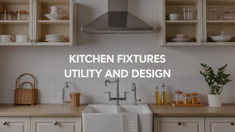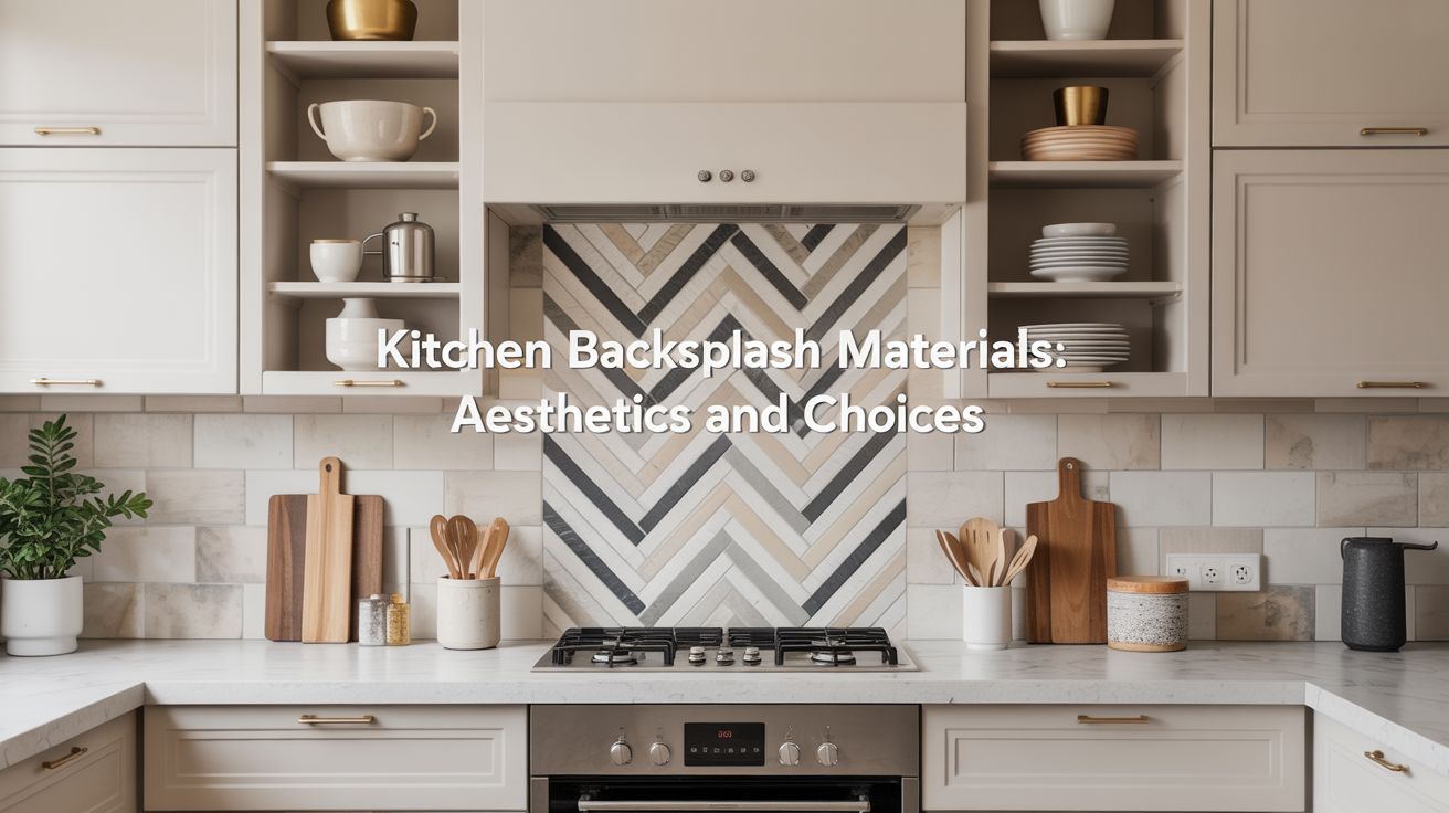
The Influence of Backsplash Materials on Overall Kitchen Aesthetics
I have been, or can be if you click on a link and make a purchase, compensated via a cash payment, gift, or something else of value for writing this post. As an Amazon Associate, I earn from qualifying purchases. Please read my full Affiliate Disclosure for more information.
Backsplash materials shape your kitchen’s feel by balancing color, texture, and light with your cabinetry. You’ll sense how ceramic warmth softens edges, glass brightens and expands space, stone grounds, and metal adds a cool edge. Texture and finish modulate glare and depth, guiding movement and perception of proximity. Grout and pattern subtly echo or contrast your counters, tying elements into a cohesive rhythm. If you keep exploring, you’ll uncover how to tune this balance for your space.
Key Takeaways
- Material choice shapes the kitchen’s mood, balancing warmth, coolness, and texture to influence overall aesthetics.
- Finish and sheen (matte vs glossy) modulate light, depth, and perceived space in the room.
- Backsplash patterns and colors create visual rhythm, guiding the eye without overpowering cabinetry.
- Textural contrast between backsplash and cabinetry adds depth while maintaining cohesive harmony.
- Practical aspects (durability, maintenance, moisture resistance) affect long-term look and usability.
Color and Finish Interplay With Cabinetry
Color and finish don’t just coat a backsplash; they set the mood alongside your cabinetry, guiding how light and texture travel through the space. You’ll notice color contrast between cabinetry and backsplash shapes the perceived depth, influencing how you move through the kitchen. Choose a finish sheen that mirrors the cabinet’s character: a glossy surface can brighten, while a matte texture softens glare and emphasizes tactility. Consider restraint: high contrast demands careful balance to avoid visual chaos. Align undertones so cool or warm hues harmonize, enhancing cohesion. This approach preserves clarity, spatial rhythm, and tactile richness without overpowering your design intent.
Texture and Depth: How Surfaces Change Perceived Space
Texture acts like a spatial rumor mill: it can make a surface feel nearer or farther, warmer or cooler, simply by how rough or smooth it is. You’ll notice texture shaping perception, guiding how you read depth and space in your kitchen.
- Emphasize textural contrast to carve visual hierarchy without overcrowding
- Use varied textures for visual layering that stays cohesive
- Pair matte and glossy finishes to modulate light and depth
- Let subtle tactile cues support spatial awareness, not distract from function
Material Family: Ceramic, Glass, Stone, and Metal Comparisons
When choosing backsplash materials, how do ceramic, glass, stone, and metal align with your kitchen’s color sense, spatial cues, and tactile priorities? You’ll feel ceramic’s matte warmth versus glass’s crisp reflectivity, stone’s natural veining against metal’s cool edge. Each material shapes perceived space: ceramic softens corners, glass enlarges light, stone grounds texture, metal adds edge. Consider personalized accents through color, pattern, and grout. Weigh eco friendly options like recycled glass or responsibly quarried stone to align with values without sacrificing impact. Your choices influence rhythm, scale, and touch—crafting a cohesive, expressive backdrop that respects function, durability, and everyday use.
Light Reflection and Ambiance in Kitchen Design
Light interacts with your backsplash to set the room’s mood, so consider how reflections, glare, and diffusion shape the kitchen’s atmosphere. You’ll notice lighting effects alter depth, color warmth, and perceived space, especially with glossy or matte textures. Natural sunlight interacts differently across materials, highlighting subtle tones and enhancing texture. Prioritize composition and rhythm, letting light sketch the space rather than overwhelm it.
1) Optimize angle of windows and fixtures to control glare
2) Pair reflective surfaces with matte textures for balance
3) Use warm or cool whites to modulate mood
4) Leverage natural sunlight for dynamic, evolving ambiance
Durability, Maintenance, and Practicality by Material
Durability, maintenance, and practicality vary by material, so pick a backsplash that fits your daily rhythms and cleaning habits. You notice how wall protection shifts with texture: glossy surfaces wipe clean, while matte textures hide fingerprints but may require gentler care. Moisture resistance matters near sinks and ranges, guiding your color and join gaps toward tighter seams. For high-traffic kitchens, choose materials that resist impact and heat without warping, allowing quick wipe-downs and regular upkeep. Visualize space: lighter tones feel airy, darker shades anchor depth, and tactile grains reveal care routines. Your choice balances durability, ease, and sensory comfort.
Budget Considerations Across Backsplash Options
Budget often dictates option choice, steering you toward materials that balance upfront cost with long-term value while still honoring how the backsplash reads in light, space, and texture.
- Prioritize budget options that deliver durable surface life and easy maintenance, reducing hidden costs.
- Compare cost effective choices by material and installation, noting labor time and waste.
- Consider neutrals and patterns that scale with room size and natural light, preserving perceived space.
- Plan for long-term value: resale appeal, ease of cleaning, and compatibility with future updates.
Color, texture, and placement matter; choose thoughtfully.
Style Vibes: Timeless Charm Vs Modern Edge
Style vibes matter: timeless charm or modern edge set the mood before you even pick a tile. You’ll notice color sensitivity guiding your choices, shaping how light plays on textures and perceived space. Timeless charm leans on warmer neutrals, soft reflections, and vintage influences that invite coziness without clutter. Modern edge favors cooler tones, high-contrast joints, and clean lines that amplify air and movement. Consider faux finishes to simulate age or sheen, adding depth without overwhelming. Balance is key: let texture tell the story while color and scale respect room proportions, ensuring the backsplash harmonizes with cabinets, lighting, and your evolving style.
Coordinating With Countertops and Fixtures
When you’re coordinating a backsplash with countertops and fixtures, the aim is to create a cohesive rhythm across surfaces. You’ll feel the room’s balance through color, texture, and light, guiding how materials relate without shouting. Focus on edges, silhouettes, and subtle contrasts to keep space legible and inviting.
1) Prioritize color coordination between backsplash and countertop tones, allowing fixtures to echo hues without overpowering.
2) Align fixture finishes with countertop textures to minimize visual noise and enhance perceived depth.
3) Use scale and spacing to maintain rhythm, ensuring subtle alternation rather than abrupt shifts.
4) Consider profile and placement of fixtures, so integration reads as intentional design rather than decoration.
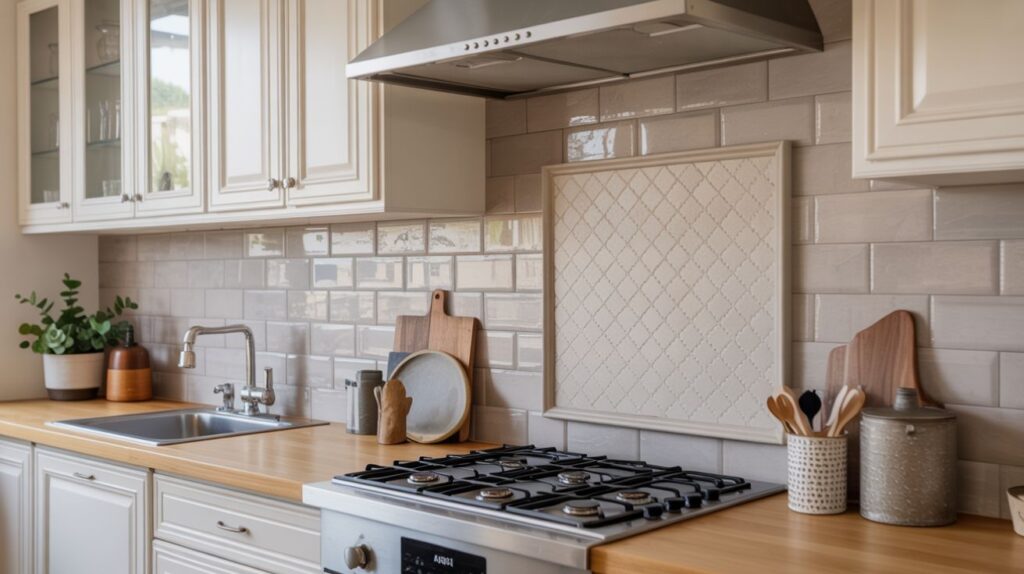
Patterns, Grout Choices, and Visual Impact
Patterns, grout choices, and visual impact aren’t just about looks; they shape how you perceive space. You notice color shifts, scale, and texture as your line of sight travels across the backsplash. A controlled pattern variety adds rhythm without overwhelming, guiding movement through the kitchen and hinting at room proportions. Grout color matters as much as tile shade, defining edges and contributing subtle depth or flatness. Opt for restraint: complementary tones, moderate contrast, and consistent texture to preserve clarity. This approach keeps focus on craft, not clutter, ensuring your backsplash amplifies light, space, and tactile experience.
Creating Cohesion: Balancing Statement Backsplashes With Subtle Palettes
To create cohesion, you’ll balance a bold backsplash with a soft, breathable palette that lets textures read as depth. Consider how color temperature, light, and spatial flow guide the eye, so the statement tile never overwhelms the room. Let subtle hues and materials weave a tactile rhythm that anchors the focal piece without competing with it.
Subtle Palette Harmony
Subtle palette harmony hinges on quiet alignments: statement backsplashes should echo, not shout, the surrounding cabinetry, countertops, and walls. You create cohesion through delicate contrasts, mindful textures, and thoughtful color shifts.
- Observe color coordination between surfaces, allowing subtle progression rather than bold clashes.
- Favor matte or satin finishes to reduce glare, guiding the eye with controlled surface gloss.
- Use patterns that repeat small, shared motifs for spatial rhythm without overwhelming.
- Consider light reflections and shadow cast by the layout to enhance depth and coherence.
Balanced Statement Backsplashes
Balanced Statement Backsplashes: you balance bold speak with quiet calm, letting the backsplash announce itself while the surrounding palette whispers. You tune color relationships so a statement tile reads as wall art without shouting, guiding the eye through spatial rhythm. Texture takes priority—matte vs. glaze, tactile grout, subtle bevels—creating depth that remains legible from across the room. In a thoughtful backsplash installation, light plays on surfaces, casting gentle shadows that define edges without glare. Achieve cohesion by aligning chrome, wood, or stone accents with the dominant hue. Purposeful restraint yields clarity, balance, and inviting, grounded kitchen character.
Conclusion
Backsplash choices shape more than color—they set mood, depth, and rhythm in your kitchen. You’ll feel color interactions as cabinets breathe with stone, tile, or glass, while textures cue how space expands or tightens. Prioritize materials that echo your countertops and fixtures, letting light dance across their surfaces. Seek cohesive patterns, mindful grout, and balanced statement versus subtlety. When you tune pattern, texture, and tone, you craft a kitchen that’s both intimate and expansive, timeless yet alive.