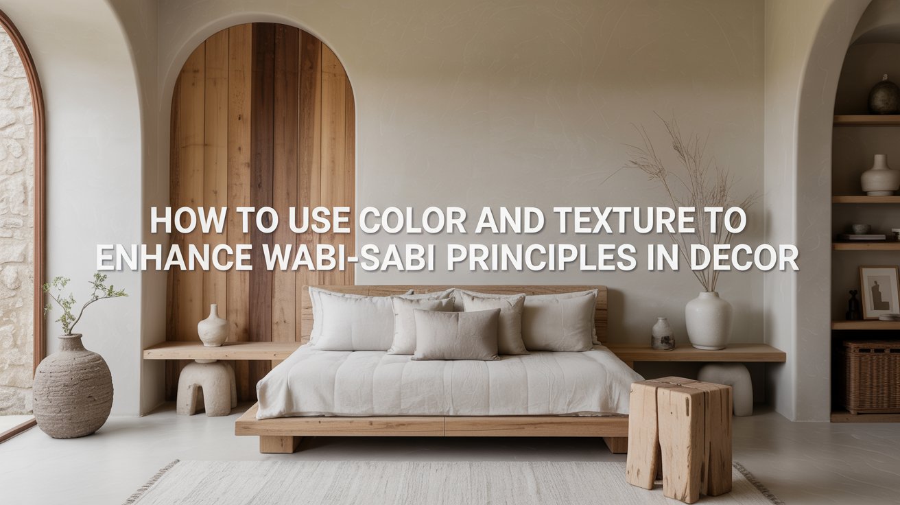
How to Use Color and Texture to Enhance Wabi Sabi Principles in Decor
I have been, or can be if you click on a link and make a purchase, compensated via a cash payment, gift, or something else of value for writing this post. As an Amazon Associate, I earn from qualifying purchases. Please read my full Affiliate Disclosure for more information.
You build a grounded, serene space by choosing earthy palettes, honest textures, and deliberate light that reveal age, imperfection, and quiet beauty. Embrace muted browns, soft greens, and gentle ochres to anchor walls and surfaces. Let patina tell its story—scuffs, seams, and irregular tones—without shouting. Use slight color shifts and imperfect patterns to invite calm; layer warm, diffused light to soften edges. If you stay with these ideas, you’ll uncover more subtle, enduring textures.
Key Takeaways
- Choose muted, earthy color palettes (browns, greens, ochres) to ground spaces without visual dominance.
- Favor matte, honed, or porous textures over glossy finishes to emphasize honesty and tactility.
- Highlight subtle color shifts and irregular tones to add depth without loud contrast.
- Use natural materials (wood, stone, linen, clay) and allow wear and patina to tell a story.
- Layer soft light and shadows to reveal texture and nuance, keeping surfaces uncluttered for calm atmosphere.
Embrace Earthy Palettes to Ground a Wabi Sabi Space
Earthy palettes ground a Wabi Sabi space by centering natural, unadorned tones. You invite calm through muted browns, soft greens, and gentle ochres. Color harmony arises when components relate modestly, not competing for attention; you let a single, quiet note speak then others fall in line. Visual balance isn’t about symmetry, but proportion—space left unused is as meaningful as the object present. Use matte finishes, porous textures, and unpolished edges to keep the eye resting. This restraint lets imperfection become intention, and every grain, hue, and shadow feels honest, grounded, and easy to understand.
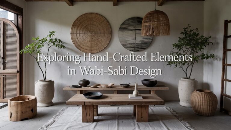
Texture as a Tactile Dialogue: Materials With Patina
Patina speaks through honest texture, telling you where age and use have gathered meaning. You’re invited to notice worn material narratives—the scuffs, seams, and soft edges that reveal a story behind the surface. Let subtle surface complexity guide your touch and choice, shaping a space that feels grounded and quietly alive.
Patina’s Honest Texture
Texture speaks softly here: patinated surfaces tell you where life has touched the material, and what time has allowed to remain. You feel patina’s honest texture in every edge, seam, and brushed grain, a trace of use becoming character. This is rustic elegance, earned through simple, honest wear. You value restraint: subtle color shifts, matte finish, and irregular tones that invite touch and contemplation. Let patinated surfaces guide your eye toward authenticity rather than perfection. Keep additions minimal, so the patina leads, not competes. In this dialogue, function and form breathe together, softly, intentionally.
Worn Material Narratives
Worn material tells a story that’s felt before it’s seen. You sense patina stories in every edge, every glaze, every scratch that humbly remains. Textures speak louder than gloss; they invite touch and memory without shouting. You read worn aesthetics as you would a quiet book—not perfect, but honest. The surface carries time, yet stays usable, present, deliberate. You value seams that hold, colors that deepen with use, and the scent of aged wood or metal that tells where hands have lingered. In this dialogue, restraint is your instrument, proof that beauty matures through small, intentional wear.
Subtle Surface Complexity
Soft variations accumulate where hands meet, turning plain surfaces into quiet conversations. You notice subtle texture as a dialogue: patina, wear, and minute irregularities that echo time. Subtle surface complexity isn’t about showiness; it’s about honesty in touch and sight. You’ll see surface irregularities catch light differently, creating visual depth without noise. Choose materials that age gracefully—stone, wood, ceramic—that reveal life in their edges and bevels. Let color remain restrained, so texture speaks first. This approach invites calm contemplation: a tactile map guiding you toward simplicity, warmth, and balance, where each patina tells a restrained story.
Subtle Color Variations and Imperfect Patterns
Subtle color variations guide the eye without shouting, inviting you to notice how slight shifts—an ember of red, a whisper of blue—live together on a single surface. You’ll sense color nuances in fabric, plaster, and wood, never flat or uniform. Imperfect patterns become quiet anchors, their asymmetry teaching restraint and touch. When a motif flickers, you pause, appreciating texture as information, not decoration. Embrace pattern irregularities as honest flaws that deepen character. This mindful awareness helps spaces feel grounded, approachable, and calm, inviting you to inhabit rather than spectacle. In practice, choose materials that invite inspection, not distraction.
Layering Light and Shadow for Quiet Warmth
Layering light and shadow creates a quiet warmth that doesn’t shout. You shape the mood by soft, deliberate illumination, letting space breathe. Light diffusion softens edges, revealing subtle textures without glare, while shadow play adds depth and contour, guiding the eye with calm precision. Position lamps near walls to bounce gentler brightness, or drape thin fabrics that filter without dulling color. Favor warm bulbs and dimmers to preserve a natural tonal center. Keep surfaces uncluttered; light becomes tactile, inviting touch and presence. This practice honors simplicity, promoting mindful living through atmosphere, nuance, and the honest glow of everyday moments.
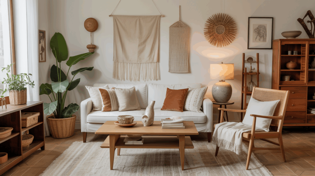
Natural Materials: Wood, Stone, Linen, and Clay
Natural texture waits in wood, stone, linen, and clay, inviting you to notice how each imperfect edge tells a quiet story. You’ll feel the warmth, weight, and fiber in your hands, letting the material speak without forcing it. When imperfections appear, you listen closer, letting them guide a calmer, more honest space.
Natural Texture Touches
Embrace texture by weaving in natural materials—wood, stone, linen, and clay—to ground a space with quiet, tactile presence. You’ll value subtle contrast: warm wood grain, cool stone, soft linen, and earthen clay. Bring depth with varied textures, not loud patterns. Let ceramic glazing offer a gentle sheen, while avoiding overly glossy sur-faces that steal restraint. For longevity, favor matte or honed finishes over synthetic finishes that shout. Pair rough and smooth, porous and sealed, to invite touch without clutter. In this mindful approach, texture becomes quiet dialogue, revealing imperfect beauty and honest, lived-in calm.
Material Imperfections Speak
Material imperfections in wood, stone, linen, and clay aren’t flaws to hide but signs of truth; they speak of time, provenance, and hands that shaped them. You’ll notice the grain’s whisper, the stone’s scars, the linen’s slub, the clay’s irregular rim. These marks aren’t defects; they’re evidence of process and material voice. Embrace visual authenticity by selecting pieces that reveal their origins rather than conceal them. Let textures and tones breathe room, avoiding over-polished surfaces. In mindful placement, imperfections anchor a space, inviting quiet reflection and tactile engagement, honoring natural cycles and the quiet honesty of material truth.
Aging Surfaces as Design Features
Cracks, patina, and softened edges aren’t flaws here; they’re the story. You craft beauty by letting aging surfaces speak, not by erasing their memory. Each mark invites touch, each hue recalls use, each texture earned. Embrace rusted metals and faded textiles as design features, not problems to fix. Let surfaces evolve with intention, pairing roughness with calm spaces for balance. The goal is presence, not perfection.
- Observe the patina as color, not damage.
- Pair rough with smooth to create contrast.
- Allow time to reveal character through change.
Balancing Simplicity and Subtle Detail in Decor
Balancing simplicity with just-enough detail keeps a room calm yet alive. You tune space by choosing restraint over excess, letting texture do the talking. Monochrome minimalism guides quiet cohesion, where light, shade, and material nuance shape mood without loud statements. Subtle details—a knotted rope, a handmade ceramic, a slate scar—offer tactility that invites touch and reflection. Use bold accent walls sparingly to puncture monotony, drawing the eye without shouting. Maintain balance by matching scale, rhythm, and craft across surfaces. In practice, edit relentlessly, measure every edge, and honor imperfection as a deliberate, essential component.
Conclusion
In a world of bright polish, you choose quiet. Let earthy tones ground you, and textures speak softly—patina telling your story without shouting. Notice subtle color shifts, imperfect patterns, the gentle drum of light and shadow. Embrace wood, stone, linen, clay as living partners, aging gracefully with you. Keep surface and space simple, but allow small details to linger. Breathe, touch, observe. Your room becomes a mindful harbor where beauty rests in honesty and restraint.