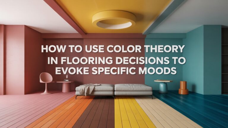
How to Incorporate Mixed Flooring Styles for Visual Interest and Cohesion
I have been, or can be if you click on a link and make a purchase, compensated via a cash payment, gift, or something else of value for writing this post. As an Amazon Associate, I earn from qualifying purchases. Please read my full Affiliate Disclosure for more information.
To create visual interest with mixed flooring, pick a unifying color family and align undertones across woods, tiles, and carpets. Balance bold patterns with quieter textures, and repeat accents to weave spaces together. Map traffic flow and use borders or thresholds to signal zones without breaking cohesion. Vary scale and finishes strategically, aligning grain direction for smooth progressions. Seek sustainable, timeless options that support a cohesive look—and you’ll uncover more about mastering progressions as you proceed.
Key Takeaways
- Use shared materials and a common color family to create seamless transitions between different flooring styles.
- Align undertones and scale across wood, tile, and carpet to maintain visual harmony.
- Balance bold patterns with quieter textures and repeat accents to reinforce cohesion.
- Map traffic flow and use borders or thresholds to delineate zones without abrupt breaks.
- Prioritize sustainability and timeless finishes to keep diverse floors cohesive and long-lasting.
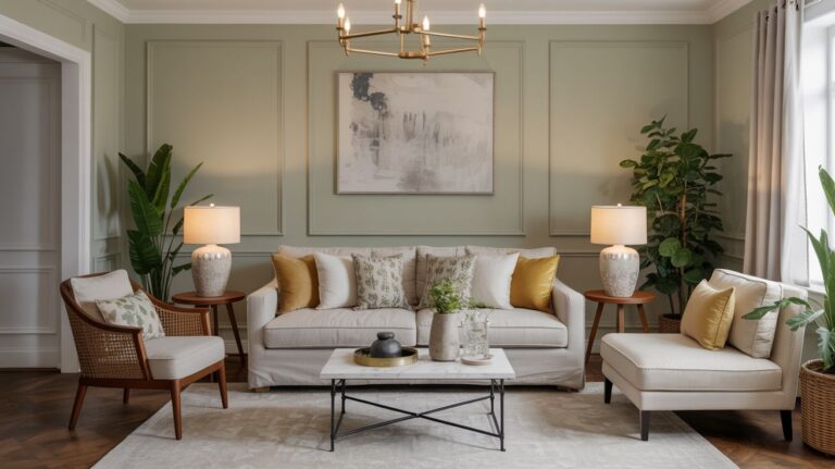
Selecting a Unifying Color Family for Mixed Floors
Choosing a unifying color family helps mixed floors feel intentional rather than disjoint. You establish a common thread that guides material choices, so progression stay cohesive. Start by selecting a core color family that suits your space’s lighting and mood, then map how each floor reads against it. A restrained color palette keeps contrast purposeful, while accent shades provide depth without breaking harmony. Consider the undertones you see in wood, tile, and carpet, and align them within oneFamily’s spectrum. Use low-contrast shifts to maintain flow, reserving bold accents for focal areas. This approach clarifies decision-making and supports effortless, cohesive design across surfaces.
Balancing Patterns and Textures Across Rooms
Balancing patterns and textures across rooms hinges on a deliberate interplay: let scale, motif, and material shift harmonize rather than clash. You coordinate bold and subtle elements by pairing a dominant pattern with quieter textures, then repeat accents across spaces for cohesion. Practice pattern mixing thoughtfully: vary motifs (geometrics, organic, stripe) but keep a common tone or color lean to avoid overload. Texture balancing matters too: smooth surfaces for contrast against tactile finishes, light versus dark, matte versus sheen. This creates rhythm without distraction, guiding eye flow and unity as you move through linked rooms.
Zoning and Transitions: Signaling Purpose With Borders
Borders define function as much as form: they signal purpose, guide flow, and delineate zones without shouting. You align spaces by creating deliberate boundaries that read as transitions, not interruptions. Use border accents to emphasize entry points, guide movement, and mark different activities within open plans. Color blocking within the flooring sequence reinforces meaning—cool tones for calm zones, warmer hues for gathering areas—while preserving cohesion. Keep transitions subtle: align grain direction, stagger patterns thoughtfully, and let scale shift with intent. When borders communicate intent clearly, you reduce confusion, sustain rhythm, and achieve cohesive variety across varied flooring styles.
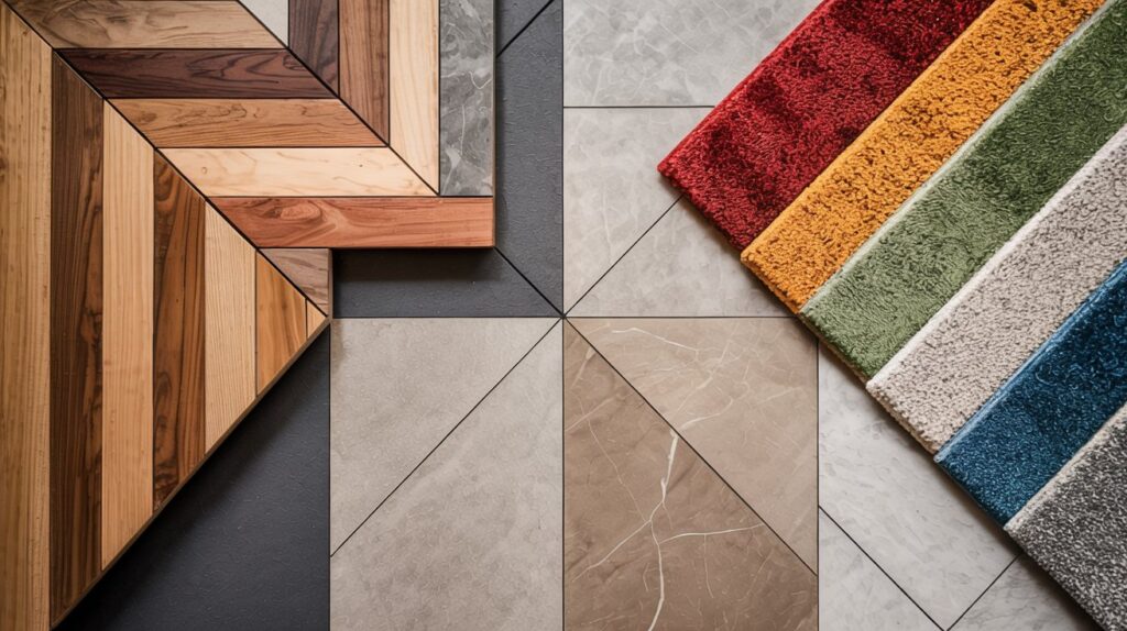
Choosing Materials and Finishes That Complement Each Other
Select materials and finishes that harmonize warmth, texture, and reflectance across spaces, so shifts feel intentional rather than arbitrary. To achieve cohesion, you assess contrast, scale, and provenance, then align core moments.
- area rug layering: pair rugs with complementary pile heights and tones to create depth without competing statements.
- furniture placement: position pieces to respect sightlines, ensuring materials mirror or gently contrast at key focal points.
- finish balance: distribute matte, satin, and gloss thoughtfully to keep light moving and spaces cohesive rather than cluttered.
Mapping Traffic Flow to Guide Flooring Choices
To map traffic flow, you’ll identify clear pathways and observe how people move through spaces. Use Zone Alignment Principles to pace progressions and place flooring changes where paths naturally converge or separate. Start from entry to exit, noting how initial impressions lead to comfortable, intuitive movement and safer, easier maintenance.
Observe Pathways Clearly
Observing pathways clearly helps you map traffic flow and choose flooring that supports it. You’ll translate movement patterns into material decisions, ensuring durability and safety without sacrificing cohesion.
- Map primary routes, noting entry points and gathering zones to guide material shifts.
- Prioritize pathway illumination and edge detailing to define edges and reduce missteps.
- Align textures and color shifts with directionality, reinforcing navigation while preserving visual unity.
This approach keeps shifts seamless, clarifies intent, and respects overall design rhythms. With precise mapping, your mixed floors guide visitors intuitively, enhancing flow and perception of space.
Zone Alignment Principles
Zones are defined by traffic patterns, and aligning them with flooring shifts guarantees seamless progressions that support both movement and perception. You map primary corridors, seating nodes, and work zones to boarders and grout lines, letting flooring cues guide flow. Choose transitions that respect use: hard surfaces where you walk, softer textures where you linger. Area rug placement matters: anchor gatherings without interrupting sightlines, define conversation areas, and protect high-traffic paths. Lighting considerations influence perception of depth and texture, so align fixtures with floor junctions and rugs to enhance cohesion. This approach yields purposeful, intuitive spatial rhythm.
Entry-to-Exit Flow
Entry-to-exit flow should guide where flooring changes occur, aligning shifts with how people move through a space. You map traffic paths to differentiate zones, ensuring progressions feel natural and purposeful.
- doorway progressions define where materials change, signaling function as you pass through entry points.
- Threshold designs control sightlines and step height, balancing safety with visual interest.
- traffic arcs align with furniture and doorways, enforcing intuitive paths and reducing abrupt shifts.
This approach keeps cohesion while preserving function, guiding decisions about where to switch materials. You achieve clarity by prioritizing seamless progressions, matching rhythm to activity, and using floor texture to cue movement.
Grain Direction and Finish Consistency for Cohesion
You’ll want to align grain direction across zones to reinforce cohesion and readability. Start with Finishes Alignment Tips that harmonize sheen, texture, and edge work for a unified feel. Keep your choices consistent, document the rationale, and test shifts to prevent visual discord across high-traffic and subtle installation areas.
Grain Direction Consistency
Grain direction consistency anchors finish cohesion: align board orientation so the grain runs in a uniform direction across adjacent pieces, ensuring a seamless visual flow and predictable edge behavior.
- Establish grain flow alignment by checking boards for matching patterns before installation.
- Maintain directional alignment across progressions to prevent subtle seams that disrupt cohesion.
- Verify end-to-end continuity during layout, adjusting placements to preserve a steady grain rhythm.
You’ll benefit from a calmer space feel, where sightlines read predictably and edges stay clean. Focus on grain flow and directional alignment to strengthen overall cohesion while keeping the look deliberate and refined.
Finishes Alignment Tips
Finishes alignment matters most when grain direction and surface tones work together to create a cohesive look; start by confirming that plank orientation and finish consistency align across crossings so edge details stay crisp and color shifts remain intentional. You guarantee consistent grain flow between adjacent rooms to reduce visual jolts. Prioritize lighting integration to reveal true finishes and avoid misleading shadows. Plan furniture placement to echo grain cues, preserving rhythm and avoiding abrupt transitions. Document your standards for sheen, gloss, and warmth, then follow them across installations. When in doubt, test samples in context and adjust before finalizing.
Practical Layout Ideas for a Harmonious Home Across Spaces
To create a harmonious home across spaces, start by defining a unifying rhythm—repeat a core color, texture, or material in each zone, then vary scale and placement to keep it engaging.
1) Plan transitions: align edge details and shared materials to create smooth shifts between rooms, balancing contrast with cohesion.
2) Zone thoughtfully: designate function by texture and finish, then connect via a common accent, such as luxury materials, while exploring depth through scale.
3) Choose sustainability: favor eco friendly options that perform well, pair with durable, timeless elements, and maintain visual clarity across the whole plan.
Conclusion
Incorporating mixed flooring works when you pick a unifying color family and keep finishes consistent enough to read as one home. Balance patterns and textures across rooms, using borders or zones to signal purpose without jarring shifts. Choose materials that complement each other in weight and sheen, and align grain direction for cohesion. Map traffic, then lay out progressions thoughtfully. With deliberate layout ideas, you’ll create a harmonious flow that feels intentional, not random.