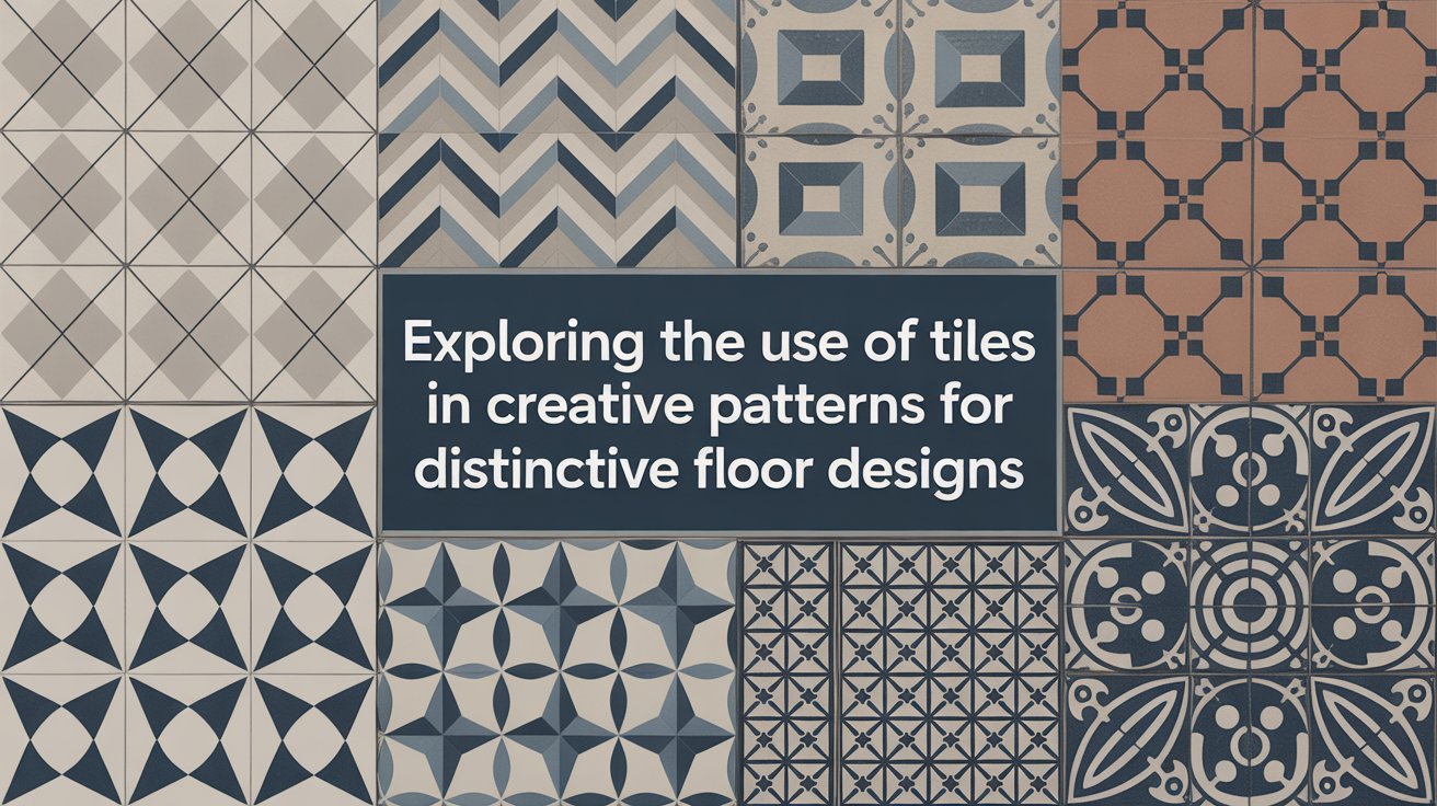
Exploring the Use of Tiles in Creative Patterns for Distinctive Floor Designs
I have been, or can be if you click on a link and make a purchase, compensated via a cash payment, gift, or something else of value for writing this post. As an Amazon Associate, I earn from qualifying purchases. Please read my full Affiliate Disclosure for more information.
Exploring the use of tiles in creative patterns starts with Pattern Play: mix geometric units like diamonds, rectangles, and triangles to form repeatable, sharp-edged layouts that align with grout lines. Pair these with Color Stories—soft gradient shifts and strategic contrast—to guide the eye. Add Texture Mashups for depth, balancing glossy and matte finishes. Design layouts that flow from a central focal point to borders, keeping maintenance in mind. If you keep going, you’ll uncover even more design secrets.
Key Takeaways
- Use mosaic units and asymmetrical arrangements to create dynamic, repeatable floor patterns with precise grout alignment.
- Employ gradient and contrast colors to guide eye flow, starting light and adding drama at focal points.
- Combine textures and finishes (glossy, matte, textured) to add depth while coordinating tones for cohesion.
- Design layouts that lead attention from focal points to borders, using proportionate tile sizes and repeat colors.
- Prioritize maintenance-friendly choices: durable materials, fewer grout lines, and easy-care finishes for longevity.
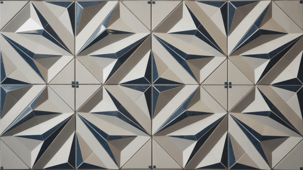
Pattern Play: Geometric Tile Arrangements
Shapes, scales, and contrast—geometric tile patterns can transform a space with precision and personality. You’ll explore how pattern play guides flow, balance, and perceived size. Start with mosaic techniques that combine tiles into repeatable units, then adapt them with asymmetrical layouts for dynamic interest. Precise alignment matters: choose grout lines that emphasize sharp edges and clean corners, avoiding busy effects that overwhelm a room. Consider tile shapes beyond squares—rectangles, diamonds, and triangles—to create directional paths. Finally, test scales against room dimensions, ensuring contrast supports readability while maintaining a cohesive, practical aesthetic for everyday use.
Color Stories: Gradient and Contrast Combos
Color is the heartbeat of a room, and here you’ll learn how gradients and contrast create mood without shouting. You’ll pair tiles with mindful color gradation, letting soft shifts guide the eye across spaces. Start light to open a hall, then introduce a deeper hue at key focal walls or steps for subtle drama. Use hue contrast sparingly—one bold color against neutrals, or a cool-to-warm sequence that mirrors daylight. Balance saturation to avoid fatigue; repeat accents to unify the pattern. Test palettes in natural light, adjusting grout and surface texture for cohesion. The result is expressive, refined color storytelling.
Texture and Material Mashups for Depth
Texture and material mashups add instant depth by pairing tactile surfaces with complementary finishes. You’ll mix mosaic textures with solid or matte tiles to create visual rhythm without overwhelming the space. Start with a dominant tile and introduce a secondary texture in a smaller area or border to guide the eye. Think contrast: a glossy finish against a textured, honed surface, or warm stone against cool ceramic. Mixed materials work best when their tones coordinate—avoid clashing palettes. Then balance with grout that blends or subtly contrasts to amplify the pattern while keeping the floor cohesive.
Layouts That Flow: From Focal Points to Borders
A well-planned layout guides the eye through a space, from focal points to borders, so your floor reads as a cohesive flow rather than a mosaic of isolated patches. You’ll align patterns to guide movement: emphasize a clear focal point integration, then let surrounding tiles radiate outward toward border accents. Use contrast sparingly to keep rhythm smooth, not jarring. Consider proportion: larger field tiles near the centerpiece, smaller accents along edges for definition. Repeat colors or textures to tie zones, while avoiding abrupt stops at walls. The result feels deliberate, balanced, and inviting, with your design guiding every step.
Maintenance-Friendly Creative Tile Designs
With maintenance in mind, designing tiles that stay beautiful without a ton of upkeep is both practical and creative. You’ll favor durable materials and simple patterns that hide wear while maximizing impact. Choose low-maintenance finishes that resist staining and fading, and pair them with minimal grout lines to reduce cleaning effort. Plan for easy access to high-traffic areas, making routine care straightforward. Incorporate grout cleaning strategies by selecting sealants and cleaning tools that prevent buildup. Don’t overlook tile sealing in damp zones to guard against moisture. A thoughtful palette and smart layout boost longevity without sacrificing style. Your space stays vibrant with less effort.
Conclusion
You’ve explored how tiles can shape a room’s mood, from geometric gridwork to lush color shifts. Keep patterns practical by testing scale, ensuring grout stays tidy, and choosing durable finishes. Mix textures for depth, but balance bold prints with calm surfaces to avoid chaos. Let focal tiles lead the eye, then frame them with softer borders that guide movement. And remember: maintenance-friendly choices keep your creative design looking fresh year after year. Your space, thoughtfully executed, feels effortless and inviting.