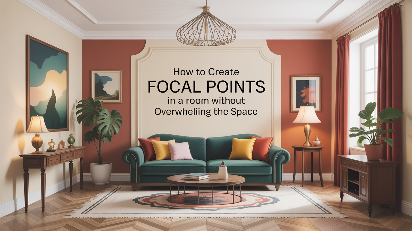
How to Create Focal Points in a Room Without Overwhelming the Space
I have been, or can be if you click on a link and make a purchase, compensated via a cash payment, gift, or something else of value for writing this post. As an Amazon Associate, I earn from qualifying purchases. Please read my full Affiliate Disclosure for more information.
To create focal points without crowding the room, pick a standout piece and let it anchor the space. Use intentional lighting to spotlight it, with surrounding spacing that breathes. Layer color and texture around the anchor, but keep negative space for calm. Balance visual weight across foreground and background, and plan in zones so you don’t overwhelm sightlines. Refresh with subtle updates rather than a full overhaul. If you keep exploring, you’ll uncover more subtle, powerful techniques.
Key Takeaways
- Choose a single standout piece as the main anchor and design around it to create breathing room.
- Use balanced visual weight by distributing elements evenly across foreground and background.
- Layer textures and subtle color contrasts to guide the eye without clutter.
- Employ negative space and deliberate lighting to highlight focal points with calm, unobtrusive emphasis.
- Zone the room (foreground, middle, backdrop) and test sightlines from key seating for clarity.
Understanding Focal Points: What They Are and Why They Matter
A focal point is the room’s visual anchor—an element that immediately catches the eye and guides the rest of the space. You’re defining where attention lands first, then letting other objects support that focus. Understanding focal points helps you balance energy, proportion, and mood without clutter. They aren’t decorations you tack on; they establish narrative and rhythm. You’ll notice how artistic focal points create personality, while minimalistic emphasis keeps the room calm and legible. When chosen with care, the point informs scale, line, and texture, aligning function with beauty. Your goal: clarity, intention, and a cohesive, welcoming environment.
Assessing Your Space: Size, Scale, and Flow
How do you know if a space works for your focal point without crowding or confusion? Start with size, scale, and flow. Measure pathways and clearance around seating; make certain you can move freely without bumping furniture. Think in zones: a clear foreground, a defined middle, and a quiet backdrop. Regarding furniture arrangement, balance large and small pieces so no single element dominates. Prioritize clutter control; hide surfaces with baskets or trays and limit decorative items near the focal point. Finally, assess sightlines from key seating positions to keep the eye focused and the room calm.
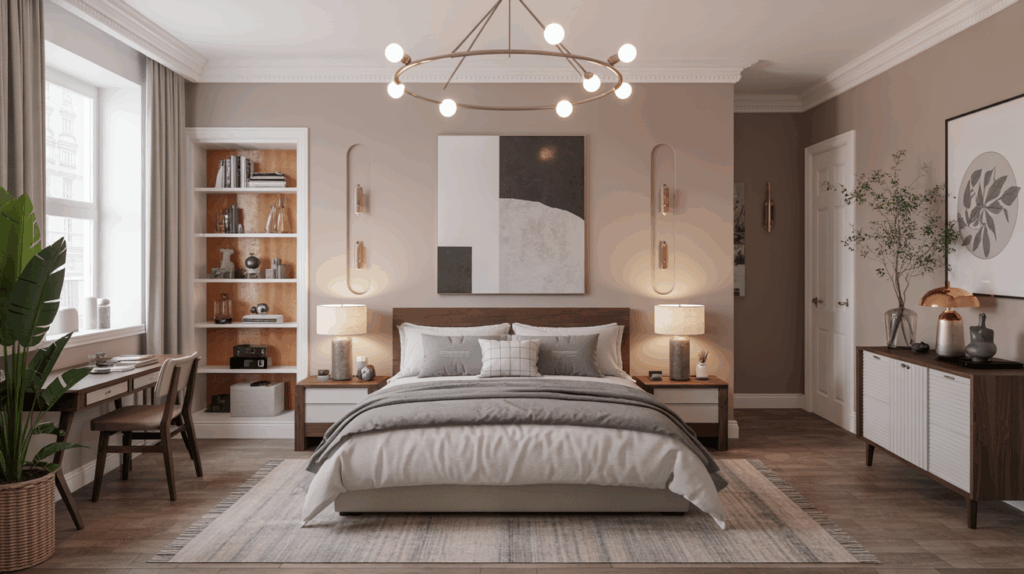
The Anchor Piece: Choosing Your Main Focal Element
Choosing your main focal element begins with a clear pick: the piece that sets the room’s tone and dictates the rest of the arrangement. You’ll anchor the space with one standout item, then design around it. This anchor isn’t merely decorative; it guides balance, scale, and rhythm. Consider how artwork curation or a distinctive furniture arrangement can lead sightlines and conversations, while still leaving breathing room. It should feel intentional, not crowded. Avoid competing focals. Test impact from multiple angles, confirming the piece harmonizes with textiles, lighting, and architectural cues. When aligned, each secondary element reinforces the anchor, creating cohesion instead of clutter.
Color Strategies: Using Hue and Tone to Draw the Eye
You’ll start by using hue contrast to guide the eye—bright against subdued, bold against soft, so your eye lands where you want it. Then you’ll layer tone to add depth, letting lighter surfaces push forward and darker ones recede, creating a perceived hierarchy. Together, these moves shape a clear focal path that feels intentional and effortless.
Hue With Contrast
Color contrast uses hue to guide the eye, letting a single, brighter or warmer tone pull attention from surrounding neutrals and saturations. When you choose a hue with purpose, you establish color harmony that feels intentional rather than random. The eye travels from muted backdrops to a deliberate focal hue, creating visual contrast without shouting. Keep saturation moderate in the background to let the highlight pop more. Balance is key: the rest of the palette should support, not compete. Your goal is clarity, not chaos.
- Align hue with function, not fluff
- Use contrast to reveal hierarchy
- Pair warm or cool accents deliberately
- Test in natural light for consistency
Tone for Depth
Tone for Depth: you can deepen perception by shifting tone rather than hue alone, layering subtle variations of brightness and saturation to create a sense of distance and volume. In practice, you’ll use color psychology to guide where depth should feel natural, placing lighter tones toward the foreground and cooler, muted tones farther back. Balance is essential, so refer to room symmetry to maintain harmony while adding perceived layers. Subtle gradients between adjacent shades prevent abrupt shifts that distract the eye. This approach preserves focal points, making them more legible without overpowering the space or compromising overall cohesion.
Texture and Material Play: Adding Depth Without Clutter
Texture and material play invites Layered Textures and Subtle Contrast to coexist without clutter, so you can create Quiet Depth that still feels intentional. You’ll notice Material Warmth and Finish Variety working together to add Visual Interest without overwhelming the space. Focus on keeping each element purposeful, letting color-free texture do the talking while you maintain a clear, cohesive mood.
Layered Textures, Subtle Contrast
Layered textures and subtle contrasts work together to add depth without clutter; start by mixing materials with clear intent—think a matte wood surface paired with a glossy ceramic and a soft, breathable fabric. You’ll create visual interest without crowding, using textural contrast and a subtle pattern to guide the eye. Balance light and shadow, texture scale, and porosity to avoid heaviness while keeping rhythm.
- Compare finishes instead of colors to highlight texture
- Vary tactile surfaces across zones for movement
- Use negative space to let layers breathe
- Choose durable, cleanable materials for easy upkeep
Material Warmth, Visual Interest
Soft warmth comes from pairing materials that invite touch with finishes that catch the eye, creating depth without crowding the space. You blend textures to build material warmth, using tactile surfaces alongside glossy or matte details. Decorative accents punctuate surface interest without overpowering the room, guiding the eye toward focal points. Choose textiles, leather, wood, and ceramic combos that feel balanced under lighting, avoiding busy repetition. Keep scale intentional: a single statement piece or a modest gallery of textures can read as cohesive. By layering thoughtfully, you create curiosity and cohesion, elevating ambiance through texture-focused material warmth.
Finish Variety, Quiet Depth
Finish variety creates quiet depth by pairing materials that invite touch with finishes that recede softly. You’ll notice how texture adds dimension without shouting, guiding the eye to your chosen focal point with quiet confidence. Use contrasting yet harmonizing surfaces to deepen perceived space, not clutter it. Subtle sophistication emerges when you balance tactile materials with matte or low-sheen finishes, keeping warmth intact while avoiding glare. Focus on focal point diversity to maintain interest. This approach creates depth through restraint, inviting careful inspection rather than loud spectacle.
- Texture as a driver of focal point diversity
- Matte finishes that soften reflections
- Material contrast with cohesive color
- Proportionate repetition for calm rhythm
Layering Elements: How to Build Interest in Stages
Layering elements isn’t about piling up decorations; it’s about guiding the eye through a room in deliberate steps, so each layer reveals the next like chapters in a well-told story. You build interest by sequencing textures, tones, and light, not by stacking excess. Begin with a quiet base and introduce a focal point myths obstacle by contrast, then add supporting accents that reinforce visual focus without shouting. Let scale and rhythm guide attention, ensuring one layer leads to the next. Thoughtful layering creates depth, clarity, and a cohesive narrative, inviting curiosity while preserving calm and balance.
Placement Principles: Positioning for Balance and Harmony
Have you ever noticed how the room feels off when something isn’t centered or balanced? Placement principles guide your eye toward balance and harmony, without crowding or awkward gaps. You’ll learn to anchor key elements, respect sightlines, and create subtle asymmetry that reads as intentional. Aim for rhythm across surfaces, letting scale and distance reinforce calm. Focus on negative space as a feature, not a flaw, and let focal points breathe. Apply these ideas patiently, testing views from multiple seats.
- Center anchors with deliberate spacing
- Balance visual weight across planes
- Use negative space as design leverage
- Prioritize harmonious scale and distance
Lighting Techniques: Spotlight, Ambiance, and Visual Weight
Lighting can pivot a room from flat to focal, using spotlight, ambiance, and visual weight to guide the eye and feel. You’ll balance tasks and drama by combining accent lighting with purpose, highlighting textures without shouting. Pinpoint a sculpture, artwork, or architectural detail, then layer soft ambient glow to soften edges and unify the space. Visual weight comes from contrast: bright accents against muted surroundings. This is mood creation, tuned to scale and proportion, not clutter. Aim for clarity: one clear focal cue, supportive shadows, and a cohesive temperature. Subtle, deliberate lighting elevates without overpowering.
Maintenance and Refresh: Keeping Your Focal Point Timely and Calm
A focal point should stay quiet and confident over time, not shout a trend and fade. To keep it timely and calm, practice regular checks and tasteful updates that honor balance. Focus on upkeep, not overhaul, and use thoughtful refresh strategies to avoid clutter or drift.
- Schedule seasonal tweaks to color, texture, and scale
- Clean discreetly, preserving material integrity
- Reassess surrounding elements for harmony
- Swap accents rather than wholesale replacements
This approach preserves focus while inviting gentle evolution, ensuring your room remains purposeful, serene, and easy to live with. Focused maintenance sustains the impact without shouting for attention.
Conclusion
You’ll curate a room that feels intentional, not loud. Start with a single anchor piece, then layer texture, color, and light to guide the eye without crowding it. Move with purpose: balance bold and calm, scale and flow, shadow and glow. Maintain quiet repetition so the focal point breathes. Refresh gently—swap accents, tweak lighting, recalibrate contrast. When you pause, your space speaks softly yet clearly, a composed spotlight amid calm surroundings.