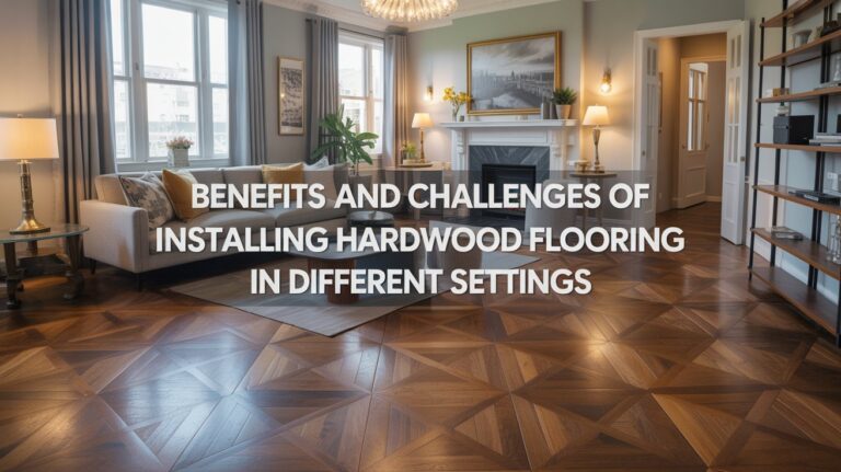
How to Use Color Theory in Flooring Decisions to Evoke Specific Moods
I have been, or can be if you click on a link and make a purchase, compensated via a cash payment, gift, or something else of value for writing this post. As an Amazon Associate, I earn from qualifying purchases. Please read my full Affiliate Disclosure for more information.
Color theory in flooring starts with your mood target. If you want calm, lean into cool neutrals or soft blues that read airy and expansive, then anchor with grounded wood textures. For warmth and energy, warm browns, ochres, and subtle reds work best, especially when balanced by cooler accents to prevent overwhelm. Lightness, contrast, and sheen shape perception of space and mood, while lighting and texture reveal true color. Continue for precise pairings and room-specific strategies.
Key Takeaways
- Choose warm flooring (reds, oranges, honey tones) to evoke coziness, energy, and inviting gatherings.
- Use cool flooring (blues, grays, muted greens) to foster calm, openness, and perceived spaciousness.
- Align floor undertone with room function and lighting to influence mood and perceived temperature.
- Balance bold hues with grounding neutrals to maintain focus while signaling confidence and creativity.
- Leverage texture, finish, and lighting to modulate color intensity and mood over the day.
Understanding How Color Affects Mood in Flooring
Color choice in flooring does more than set a backdrop; it subtly guides mood and behavior, from calm focus to energized movement. You’ll notice how psychological effects surface in daily tasks, influencing concentration, creativity, and endurance. As you explore, consider cultural associations that shape responses to hue, shade, and brightness; these cues can reinforce or counteract your intent. Your goal is deliberate selection: align flooring with desired psychological signals, then harmonize with furniture and lighting. By mapping outcomes to color categories, you create spaces that feel purposeful, cohesive, and resilient. This mindful approach transforms substrates into strategic actors in daily life.
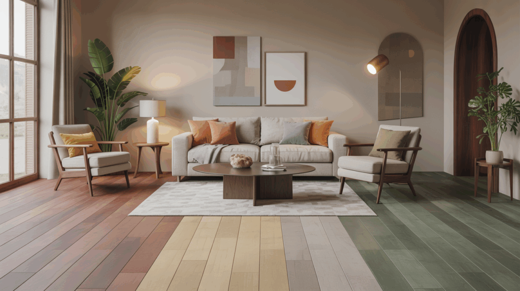
Warm Vs Cool Tones: Setting the Room’s Temperature Perception
Think about how warmth in flooring can read as physical coziness or visual heat, influencing perceived temperature in the room. Cool-toned floors shift ambiance toward calm clarity, shaping a cooler, more expansive feeling without changing the actual thermostat. Your choice should align with the space’s purpose and lighting, because color directly frames how occupants experience temperature and comfort.
Warmth Perceived Temperature
When you choose warm or cool tones for flooring, you’re shaping how a space feels before anyone steps in the door. Warm floors read as inviting, elevating coziness and energy, while cool tones cultivate calm and openness. This perception hinges on color psychology and how our brains associate hues with temperature, light, and comfort. By selecting temperature-aware neutrals or subtle tinted woods, you guide occupants’ mood influence without overt effort. Consider how reflections, texture, and adjacent finishes reinforce perceived warmth or coolness. Your strategic choice sets the stage for lived experience, shaping expectations, behavior, and overall atmosphere.
Cool Tone Ambiance
Cool tones establish a serene baseline that cools the room’s energy while expanding perceived space. You’ll leverage cool hues to modulate temperature perception, guiding how occupants feel over time. Think about how textile textures interact with light—soft weaves, sleek finishes, and tactile contrast amplify calm without quieting character. Pattern variations become strategic tools, creating visual rhythm that stabilizes atmosphere while avoiding heaviness. In flooring decisions, choose materials and tones that reflect ambient light, reducing glare and fostering clarity. This approach aligns with practical taste, ensuring your design remains purposeful, legible, and future‑savvy while supporting a cool tone ambiance.
Flooring Color Impacts Perception
Color choice in flooring isn’t just about style; it subtly scripts how warm or cool a room feels. When you lean toward warm tones, you invite inviting, tactile energy that makes spaces feel intimate and grounded; cool tones push airiness and modern clarity. Your decisions about color influence perception of space, light, and temperature, guiding how occupants experience comfort and functionality. In interior design terms, flooring color acts as a material selection cue that shapes mood and rhythm across rooms. Use intentional contrasts and harmonies to balance warmth and coolness, ensuring cohesiveness. Clarity in choice enhances design outcomes and user satisfaction.
Neutral Foundations: Creating Calm and Versatility
Neutral foundations set the stage for ease and adaptability, letting color be deliberate rather than dominant. You choose calm neutrals to anchor rooms, then let texture and form carry meaning. In flooring, texture contrast adds tactile interest without shouting, while pattern variation provides subtle rhythm that guides movement and perception. This approach grants versatility: you can shift moods with accents, rugs, or furnishings, not wholesale overhauls. Think durable materials, consistent undertones, and clean lines that reflect intentional restraint. When your base feels steady, color decisions become strategic tools, delivering clarity, cohesion, and a timeless sense of calm across spaces.
Bold Hues: Energizing Spaces Without Overwhelm
Bold hues can ignite energy in a space without tipping into chaos when you use them with intention. You harness bold hues by selecting a dominant shade and anchoring it with grounded neutrals, then layering vibrant palettes through accessories and textiles. This approach keeps momentum without distraction, guiding movement and focus. Prioritize balance: pair high-saturation colors with tactful repetitions, define zones, and avoid competing patterns. Consider material textures and lighting to modulate intensity. You’ll create environments that feel purposeful, innovative, and welcoming—where bold hues sharpen mood yet remain refined. By design, the space communicates confidence and clarity, inviting daily inspiration.
Lightness and Depth: How Luminosity Shapes Perception
Lightness and Depth reshape how a space reads, guiding your eye with luminosity to reveal or conceal square footage. You’ll notice how luminosity tricks the mind, making subtle shifts feel expansive while depth cues create a sense of room to breathe. By tuning lightness, mood follows—calm, energized, or contemplative—without adding material.
Luminosity Perception Tricks
Luminosity isn’t just about brightness; it’s a powerful cue that guides how we read space. You’ll notice lightness shifts create perceived depth, subtly steering movement and focus across rooms. By leveraging brightness contrasts, you can emphasize focal areas or downplay clutter, shaping how you experience scale without changing dimensions. This is color psychology at work in flooring symbolism: brighter floors can lift mood and widen a corridor, while deeper tones anchor a room and feel more intimate. Use luminosity strategically, pairing it with texture and grain to craft: path, purpose, and atmosphere—without overwhelming the senses.
Depth Creates Space
When you adjust lightness across a floor, you’re not just changing color—you’re shaping perception. Depth emerges from contrast, elevation cues, and luminosity progressions that guide movement and space perception. You’ll harness shade psychology to evoke openness or coziness, while color symbolism reinforces intent. Align brightness gradations with architectural lines to define zones without clutter. Subtle shifts can alter perceived height, width, and flow, making rooms feel more expansive or intimate. Prioritize clarity over ornament, ensuring durability of effect.
- Use gentle gradient progressions to imply continuity
- Pair cool lightness with warm accents for balance
- Leverage mid-tones to anchor focal areas
- Consider reflectivity to modulate glare
- Align symbolism with function and mood
Lightness and Mood Perception
Color and mood aren’t simply about tone; they’re a map for how a space feels from the moment you enter. Lightness governs perceived depth and can tune your emotional response before you notice color choices. Lighter floors expand a room, inviting openness and clarity, while deeper hues anchor corners, signaling coziness and focus. In color psychology terms, luminosity shapes salience, contrast, and balance, guiding how you experience texture, sound, and movement. By aligning lightness with intended mood, you craft environments that feel intentional, coherent, and supportive of daily tasks, patience, and creativity. Your flooring strategy becomes a precise lever for emotional resonance.
Texture, Finish, and Sheen: Enhancing Color Impact
Texture, finish, and sheen aren’t just surface choices—they amplify color’s mood, depth, and perception. You harness texture options and thoughtful finish choices to sculpt atmosphere, influencing how light and color interact across your space.
- Leverage contrast between matte and gloss to modulate perceived depth
- Combine subtle textures with bold hues for tactile, visual intrigue
- Align sheen with traffic and functionality to maintain color integrity
- Layer finishes to create nuanced reflections without glare
- Test samples at different times to confirm how texture affects mood and cohesion
Carefully chosen texture, finish, and sheen elevate color strategy into intentional, lasting impact.
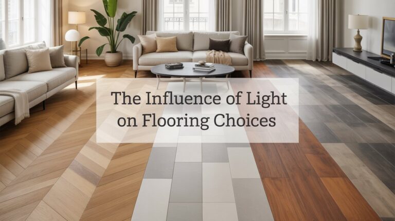
Lighting Your Floors: Natural Vs Artificial Effects
Natural light reveals true floor tones and texture, so you’ll want to account for its shifting intensity throughout the day. Artificial lighting offers control and consistency, shaping color perception to support your design goals. By balancing lighting color temperature with your flooring, you set the mood, highlight details, and guide how the space is experienced.
Natural Light Impact
Natural light transforms your flooring by revealing true tones and subtle shifts across the day, so you can plan finishes that stay consistent from morning coffee to evening shadows.
- Track how natural light changes color perception at different hours
- Use durable finishes that resist wear under sun exposure
- Choose neutrals with slight warmth or cool undertones for balance
- Consider floor direction to optimize sunlight influence
- Test samples in your space at multiple times of day
Thoughtful timing and color strategy align, ensuring your floors communicate intentional mood shifts rather than reactive changes. natural light remains a guiding constant.
Artificial Lighting Effects
As you move from how natural light reveals color to how artificial lighting can reshape it, you’ll see that lighting choices become a strategic tool for mood and consistency. With deliberate placement and layering, artificial lighting effects can refine undertones, reveal texture, and stabilize color perception across hours. You’ll balance brightness, direction, and warmth to support your flooring palette, avoiding washout or dullness. This approach supports mood enhancement by aligning luminance with intended ambience, whether calm, energized, or refined. Stay precise: test samples under common fixtures, note responses, and adjust for predictable outcomes that reinforce your design narrative.
Lighting Color Temperature
How does color temperature steer the tone of your floors under different lights? You’ll balance lighting color temperature with ambient light to craft mood, depth, and perceived material. In natural settings, cooler temperatures highlight grain and realism; artificial lighting can warm or cool spaces, altering hue and texture. Your goal is consistency: align floor color with primary light sources, not fight them. Consider the spectrum, CRI, and the room’s use, so ambients support the floor’s mood rather than obscure it.
- Match ambient light to the floor’s undertone for harmony
- Prefer higher CRI for true color rendering
- Use cooler temps to emphasize modern materials
- Employ warmer temps to cozy existing woods
- Test samples under real lighting conditions
Color Pairing: Flooring and Wall/Accent Colors
Color pairing between flooring and walls or accents is the strategic backbone of a cohesive space: the floor sets the tonal stage, while wall and accent colors define mood and emphasis. You’ll leverage color psychology to predict how combinations feel under different light and activity. Pairings should balance contrast and harmony, using color symbolism to communicate intent—calm blues for serenity, warm ochres for approachability, deep charcoals for refinement. Consider undertones and material textures, ensuring the palette both supports furniture and enhances architecture. Thoughtful matching transforms rooms into purposeful narratives rather than random décor. Aim clarity, resonance, and lasting impression.
Room Type and Function: Tailoring Flooring to Use
Choosing flooring that fits the room’s function isn’t just about aesthetics—it’s about durability, safety, and daily flow. You’ll align color theory with use, selecting patterns that reinforce purpose while supporting interior design goals and flooring trends. Think traffic, moisture, and cleansing needs as you choose textures and seams. When you tailor to room type, you harmonize mood with practicality, guiding occupants naturally through spaces.
- Consider high-traffic areas with durable finishes
- Use moisture-resistant options in kitchens and baths
- Match acoustics to activity levels in living spaces
- Prioritize easy maintenance in home offices
- Use color scale to subtly define zones within open-plan layouts
Longevity and Practicality: Balancing Mood With Durability
Durability isn’t a blunt attribute—it’s a design decision that amplifies mood without sacrificing function. You balance mood with practicality by selecting flooring that harmonizes color intention with performance. Consider wear resistance as your first filter: it guards your palette’s tone through foot traffic and furniture. Next, assess stain durability, ensuring your chosen hue remains intentional after spills or panning sunlight. Durability isn’t about compromise; it’s about aligning mood goals with lifecycle needs. Short-term beauty fades without resilience, while robust materials preserve atmosphere. Prioritize a thoughtful mix of color, texture, and composition to sustain emotional impact over time.
Conclusion
Color sets the rhythm of a room, so choose flooring that whispers the mood you want. You’ll harness warmth with honeyed planks, calm with cool grays, or spark energy with bold tones, all balanced by lightness, depth, and smart lighting. Pair wisely with walls and furniture, consider function, and prioritize durability. When you align material, color, and ambience, your floors become the foundation of a deliberate, living design vision—clear, cohesive, and endlessly adaptable.