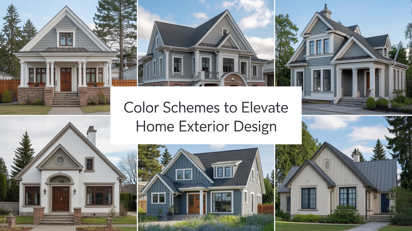
Exploring Color Schemes That Can Elevate Your Home’s Exterior Design
I have been, or can be if you click on a link and make a purchase, compensated via a cash payment, gift, or something else of value for writing this post. As an Amazon Associate, I earn from qualifying purchases. Please read my full Affiliate Disclosure for more information.
Exploring color schemes that elevate your home’s exterior starts with timeless neutrals. Consider sage, greige, taupe, or charcoal as a durable base, then add bold accents on doors, shutters, or railings to create depth. Coastal palettes with whites and soft blues or earthy tones that echo your landscape can feel timeless and cohesive. Test swatches under morning light and evening shade to see true effects. If you keep going, you’ll uncover more practical tips to fine‑tune harmony.
Key Takeaways
- Use timeless neutrals for a versatile base, pairing lighter trim with a medium body and darker accents for depth.
- Incorporate earthy tones to blend with natural surroundings while emphasizing texture and material quality.
- Apply bold accent colors strategically to highlight architectural features and create focal points.
- Consider coastal-inspired palettes with white, soft blues, and navy trims for a refreshed, classic look.
- Test swatches under varying lighting to ensure enduring undertones and cohesive harmony across day-to-night conditions.
Timeless Neutrals for Elegant Curb Appeal
Neutral tones never go out of style, and they create a timeless foundation for home exteriors. You’ll notice how sage, greige, taupe, and charcoal pair with natural textures to elevate curb appeal. This approach emphasizes balance: lighter trim against a medium body, darker accents for depth, and minimal ornamentation to keep lines clean. In practice, choose a single dominant neutral and use a second as an accent for doors, shutters, or railings. For garden landscape, it harmonizes with planting schemes and stone paths. Pair with outdoor furniture that mirrors the neutral palette for cohesive, inviting outdoor living spaces.
Bold Accents That Highlight Architectural Features
Bold accents can instantly draw attention to a home’s strongest architectural features, from column capitals to window bays. In this section, you’ll learn how to use bold hues strategically to emphasize form without overpowering it. Choose color contrasts that outline structural elements—think a darker shade for trim against lighter siding or vice versa—to create depth and definition. Focus on porch accent colors that echo interior details for cohesion, so outdoor spaces feel intentional. Consider garden color schemes as a complementary backdrop, ensuring the bold choice doesn’t clash with surrounding plantings. Subtle, purposeful application yields striking, lasting curb appeal.
Coastal-Inspired Palettes for Bright, Airy Exteriors
Coastal-inspired palettes turn bright exteriors into airy, inviting backdrops that feel breezy and timeless. You’ll leverage beach inspired hues to evoke sunlit shorelines while keeping structure legible and calm. Pair white or very light neutrals with soft blues, sage, or dune tones to reflect seascape restraint. Nautical color schemes work best when contrast remains subtle—think navy accents on trim or door for crisp definition without overpowering the facade. Consider materials and texture to enhance lightness: smooth siding, light stone, and minimal hardware. The result is a durable, welcoming exterior that reads coastal, yet refined and versatile.
Earthy Tones That Blend With Landscape
Earthy tones offer a grounded alternative that harmonizes with your surroundings, especially after exploring coastal-inspired schemes. You’ll find that earthy shades, from warm greiges to clay browns, support landscape harmony without overpowering features. Use these tones as a backdrop to highlight natural material pairing—think stone, timber, and brick that age gracefully. Aim for subtle contrast rather than loud statements, so plants and terrain remain focal points. Consider texture as color; rough surfaces read as deeper hues in varying light. A restrained palette achieves cohesion between structure and site, guiding curb appeal toward timeless, low-maintenance elegance.
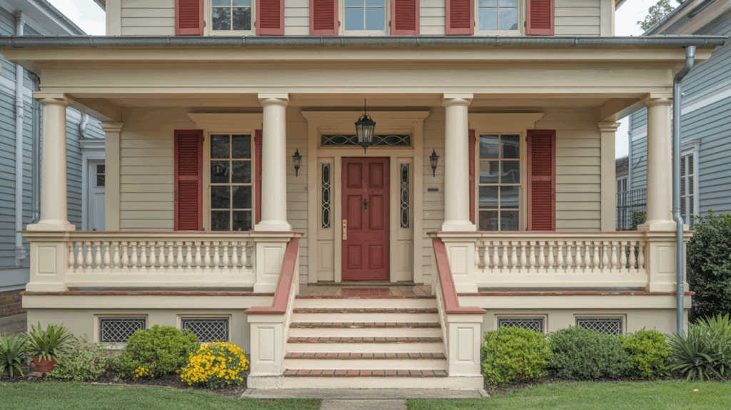
Classic Two-Talette Schemes for Traditional Homes
Classic two-toned palettes offer a timeless, refined approach for traditional homes, pairing a dominant body color with a lighter or darker accent hue to emphasize architectural details and proportion. You’ll create visual contrast that highlights trim, columns, and cornices, strengthening curb appeal without overwhelming historic character. Choose a dominant shade aligned with the house’s era, then select an accent that clarifies proportions. Consider landscape integration when locating plantings and hardscapes to support the palette. Prioritize historic preservation by honoring material textures and window details. Maintain balance, avoid excessive saturation, and ensure the scheme respects neighborhood context and long-term property value.
Modern Monochrome Looks With Subtle Contrast
You’ll notice how subtle shadow play adds depth to a monochrome exterior without shouting color. Use monochrome accents to keep the look cohesive while allowing texture to emerge through tone. This restrained approach relies on light, material variation, and careful contrast to create interest.
Subtle Shadow Play
Subtle shadow play in modern monochrome schemes uses restrained contrast to add depth without disrupting clean lines. You’ll notice shade variations across siding, trim, and roofing, which create visual texture while preserving a unified palette. Shadow patterns form where light interacts with architectural details, highlighting depth without loud gradations. Keep finishes matte or lightly satin to maintain sophistication and reduce glare. Directional lighting further enhances the effect at dusk, emphasizing form over color. Focus on proportional contrasts rather than bold shifts, so the home reads cohesive from curb to entry. This approach elevates elegance through quiet, deliberate nuance.
Monochrome Accents
Monochrome accents pull a modern exterior together by using restrained contrast to highlight architectural details without breaking the clean, unified look. You’ll notice how surface variation—matte, gloss, or subtle texture—adds depth without shouting color. This approach supports landscape integration, letting plantings and pathways feel cohesive rather than siloed from the structure. Choose a single, dominant hue with one or two muted companions to preserve clarity. Historical influences can appear in proportion, window trim, and material choices that nod to eras of design while staying current. The result is timeless sophistication—calm, purposeful, and easy to maintain.
Texture Through Tone
Texture through tone adds depth to modern monochrome exteriors by using light, dark, and mid hues within the same color family. You’ll achieve subtle contrast without busy patterns, focusing on tonal variation across materials and finishes. Use textural contrast—think matte sidings paired with slightly glossy trim—to emphasize form while maintaining cohesion. Aim for tone depth by selecting one primary shade and layering lighter and darker accents through doors, window surrounds, and landscape elements. This approach preserves a streamlined look while delivering visual interest. In practice, balance is key: restraint, intentionality, and consistent color temperature drive refined curb appeal.
Weather-Resistant Finishes and Their Color Impacts
Weather-resistant finishes don’t just protect your home; they also influence color perception and curb appeal. When you choose coatings designed for durability, you influence hue behavior under sun, rain, and shade, preserving intended tones longer. You’ll notice lighter finishes reflect heat more effectively, while deeper variants can deepen perceived saturation as weathering occurs. Consider solar panel integration and how nearby panels alter color interaction; some finishes can help minimize glare and maintain balance with solar arrays. Eco friendly paint options offer low volatile organic compounds, reducing odor and environmental impact without compromising performance. Pick reliable brands that document UV resistance and washability.
Lighting-Driven Color Decisions for Exterior Walls
As you consider lighting, you’ll weigh daylight versus artificial glow to see how each alters wall color in different hours. Shadow-driven hue choices emerge as notable factors, since nearby structures and landscape can cast changing tones across the façade. Coordinate fixture color with your chosen palette to guarantee the lighting reinforces the intended mood, rather than competes with the wall color.
Daylight Vs Artificial Glow
When daylight hits exterior walls, colors can read differently than they do under artificial glow, so start by testing swatches in both scenarios. You’ll notice hues shift with temperature and brightness, altering perceived saturation and warmth. To plan reliably, compare in morning sun, midday shade, and evening glow, then note how your choices interact with plant foliage and outdoor furniture. Consider a palette that maintains cohesion across lights, leaning toward undertones that endure both environments. If a color feels off under artificial lighting, adjust with a slightly cooler or warmer tint. Informed decisions yield enduring curb appeal and harmonious outdoor spaces.
Shadow-Driven Hue Choices
Shadow-driven hue choices hinge on how shadows sculpt exterior walls throughout the day, shaping color perception as light moves. You’ll assess shade gradients and shadow patterns to predict how finishes read from morning to dusk. Start with neutral bases that tolerate shifts, then pair accents that either harmonize or pop as shadows deepen. Consider surface texture: smooth walls reveal subtler changes, while rough textures exaggerate contrast. Use cooler undertones where high sun dominates and warmer tones where shade lingers, ensuring legibility of architectural details. Test samples at different times, documenting observed color shifts for informed selections.
Fixture Color Coordination
Fixture color coordination ties exterior wall shades to lighting decisions, ensuring the palette reads consistently from daybreak to dusk. You’ll align fixture finishes and bulb temperatures with wall tones, selecting options that complement rather than compete. For vintage fixtures, match warm light with earthy or muted tones to preserve nostalgic charm without overpowering architectural details. When you favor minimalist styles, lean toward clean metal finishes and simple forms that echo wall color neutrality, supporting a calm exterior motif. Consider contrast sparingly: a bold accent light can sharpen texture, while subdued fixtures maintain timeless cohesion across façade elements. Revisit at dusk for true harmony.
Testing and Tuning Swatches to Achieve Perfect Harmony
To test swatches effectively, start by comparing them under the same light conditions you’ll see most often at home—for example, morning sun and late afternoon shade. Then note how each hue shifts and how the undertones interact with adjacent elements. Use a controlled setup: a dedicated wall or board, consistent distance, and neutral daylight bulbs for backlighting when needed. Practice color testing across different times of day to reveal true compatibility. Swatch tuning involves adjusting saturation and value, narrowing options to those that deliver balanced contrast. Finally, select a cohesive palette that feels harmonious in real-world lighting.
Conclusion
You’ve explored a spectrum of exterior color ideas, from timeless neutrals to modern monochromes, and from coastal lightness to earthy grounding. As you decide, test swatches under different lighting and observe how finishes weather over time. Consider your home’s architectural features, surrounding landscape, and regional climate to guide harmony and durability. Start with a core neutral, then layer with accent colors to highlight details. With careful tuning, your exterior will read cohesive, inviting, and enduring.