How to Assess Scale and Proportion to Harmonize Your Front Elevation With the Surroundings
I have been, or can be if you click on a link and make a purchase, compensated via a cash payment, gift, or something else of value for writing this post. As an Amazon Associate, I earn from qualifying purchases. Please read my full Affiliate Disclosure for more information.
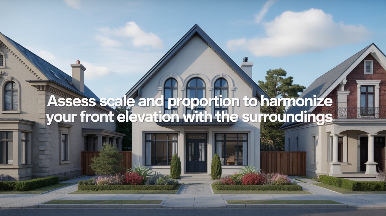
To harmonize your front elevation, assess scale and proportion by comparing massing to nearby buildings and street context, then test how eye level, reach, and rhythm feel at human scale. Analyze window‑to‑wall ratios, door sizes, and the hierarchy of openings to keep balance. Align rooflines, materials, and edging so sightlines stay coherent across streetscapes. Use on‑site tests and planting to soften edges, ensuring a cohesive, inviting approach as you refine these relationships. More insights await if you continue.
Key Takeaways
- Compare your facade’s eye level, reach, and rhythm to human scale and neighboring buildings to ensure comfortable proportions.
- Analyze massing and silhouette to relate to surrounding heights, setbacks, and street context for cohesive streetscape.
- Check window-to-wall ratio, door sizes, alignment, and hierarchy to maintain functional balance and visual coherence.
- Align rooflines and material textures with nearby structures, ensuring sightlines and edge definitions read as a unified front.
- Use on-site checks with markers and landscaping to test perceived scale, rhythm, and harmony from key vantage points.
Understanding Scale and Proportion in Front Elevations
Understanding scale and proportion in front elevations hinges on how building forms relate to human perception and site context. You’ll examine how facade proportions echo human scale—eye level, reach, and rhythm—so the composition feels coherent at a distance and up close. Consider architectural style as a lens for interpreting proportion choices, then compare these with historical context to avoid anachronisms. You’ll assess element hierarchy, window-to-wall ratios, and cornice lines to guarantee legibility and harmony with neighboring structures. This analytical approach clarifies how form communicates purpose, culture, and sensation, guiding informed decisions about composition, materiality, and contextual resonance.
Analyzing Massing, Rhythm, and Street Context
Massing sets the stage for rhythm and how a street reads from a distance to up close. You assess how volume, massing hierarchy, and silhouette influence perception, then connect them to street context. Examine how front elevations respond to neighboring scales, building heights, and setbacks, guaranteeing harmony rather than competition. Rhythm emerges through repetition, modulation, and the cadence of verticals and horizontals, guiding eye movement along the facade. Consider landscape integration to soften edges and integrate planting, walls, and sky. Guarantee color coordination supports massing logic, avoiding jarring contrasts, so the composition reads as intentional and cohesive.
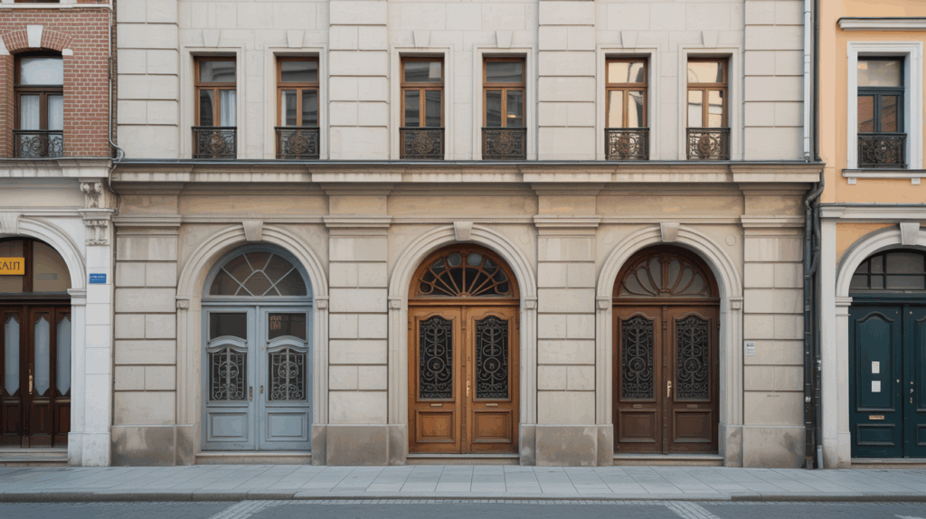
Evaluating Door, Window, and Proportional Relationships
Door and window relationships are the key to reading a facade’s proportion and rhythm, shaping how light, scale, and occupancy are perceived. You evaluate how openings relate to overall mass, considering alignment, symmetry, and hierarchy. Door sizing should reflect function and access while maintaining vertical and horizontal balance with adjacent features. Window placement governs daylight quality, views, and exterior rhythm; stagger or align openings to reinforce zoning and proportion without crowding facades. Assess margins, mullions, and proportion rules, then test repeatability across facades to ensure coherence. Precision in sizing and placement yields legible, harmonious elevations with meaningful outdoor interaction.
Aligning Rooflines, Materials, and Sightlines
Aligning rooflines, materials, and sightlines requires a cohesive approach that reads the building as a single compositional gesture. You assess how a roofline aligns with surrounding forms, how material harmony connects textures, and how sightlines guide perception from key viewpoints. Consider proportional echoes between eaves, sill lines, and adjacent structures to reduce visual jutter. Seek continuity in edge definitions and rhythm, so the roofline alignment feels intentional rather than imposed. Choose materials that reflect context while maintaining crisp progressions. The result is a balanced silhouette where roof, surface, and sightlines reinforce each other, enhancing coherence and perceived scale.
Practical On-Site Checks and Adjustments for Harmony
On site, you verify harmony by testing how the built form reads from real vantage points and adjusting with precise, iterative tweaks. You assess sightlines, distances, and human scale, documenting how each tweak shifts perception. Use temporary markers to compare perceived height, mass, and rhythm against surrounding elements. Check landscape integration by evaluating how planting beds, walls, and paving relate to the facade’s setback and alignment. Prioritize visual flow, ensuring transitions feel natural as you move along approaches. Record measurements, justify changes with context, and recheck from multiple positions. Final tweaks consolidate harmony between form, site, and surrounding textures.
Conclusion
You should conclude by tying scale and proportion to the street’s character, showing how massing and rhythm relate to surrounding buildings. You’ll want to emphasize that door and window proportions anchor the façade, while rooflines and materials cue harmony with context. Consider sightlines and on-site checks to verify alignment, then adjust deliberately. In short, the outcome depends on a thoughtful balance of proportion, rhythm, and material choices that respect prevailing scale without sacrificing your design intent.